
Hand-painted acrylic brush strokes on a letterpress wedding invitation suite, menus and signage galore, an Oscar de la Renta wedding dress, a cocktail bar complete with oysters and custom signature ice cubes, endless florals, and oh so many shades of blue…this is Kelsi and John’s wildly romantic Oregon wedding - recently featured on Junebug Weddings.
Read More
The Letterist Featured in The Lane
For years I’ve told clients and friends searching for wedding inspiration…look to Australia! That’s where its at. While the US wedding industry is by far the largest and most pervasive, their well-oiled consumer media machine tends to draw out a line of neatly defined seasonal trends and then vendors color safely and convincingly within them.
Australia, on the other hand, either because it is smaller or further away, gets away with pushing those boundaries and consistently setting new, striking, and unexpected trends.
I can almost assume that when an interesting dress, seating chart, or cigar bar set-up catches my eye and stands out of my overly full wedding Instagram feed…8 times out of 10, its from Australia. (And at least half of those times, its in The LANE).
Which is why I am THRILLED to announce that The Letterist is now featured in Melbourne-based The LANE - by far the most unique and aesthetically-driven online wedding magazine and curated vendor directory there is. See the post and some wedding stationery advice here.


A Modern Cocktail Reception, Featured in PNW Weddings
in Weddings, Inspiration, Art, Food
Deep teals, wistful florals, classic cocktails, and delicious nibbles in a striking and intimate setting…what more do you need? Featured in this month’s Pacific Northwest Weddings issue, this gorgeous editorial is bound to leave you inspired, hungry and thirsty.
Credits: Art Direction Sarah Williams | Editor Tracy Howard Garton | Photography Katie Newburn | Set Styling Kayla Hoppins | Florals Kailla Platt | Location Dame Restaurant | Stationery Design The Letterist


Vienna Art Book Fair #1
in Travel, Art, Inspiration
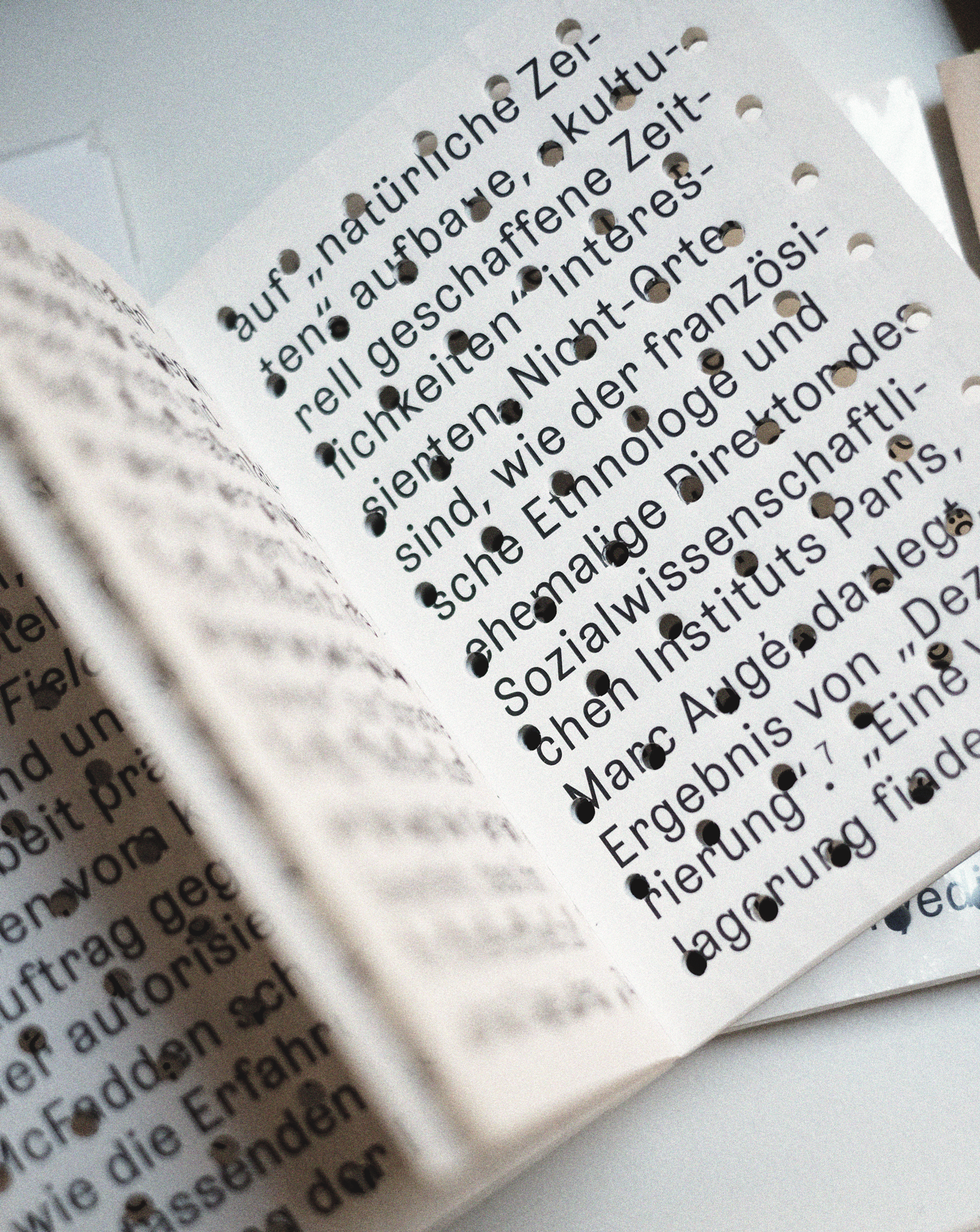
A postcard on the table at the entrance to the Vienna Art Book Fair #1 reads “It’s an artists’ book if an artist made it or if an artist says it is.” As good a definition as any really, telling you everything and nothing at all…ironically mocking this infamously hard to define art form.
To me, artist books are single-handedly the best and most underrated source of inspiration for any form of print media design. Through their highly intentional and sophisticated approach to (and seamless marriage of) concept, paper, print, finishing, typography and design, they challenge and push the boundaries (envelope!?) of everything you had ever imagined was possible.
I’ve always felt that your creation isn’t worthwhile if your printer doesn’t look at your idea initially and say, “this is impossible.” And basically, an artist book fair is a room full of people who share that view. These are precisely the artists, designers, thinkers, writers, printers, and publishers who take what’s seemingly impossible and say, cool, let’s try it.
Think complex folds that tell a story, strategically placed holes playing hide and seek, layers upon layers that lure you in…the words “art” or “design” don’t even seem appropriate, some pieces are purely architectural. And I’m not even getting into the content. Whether its poetic, abstract, personal, political or comical…its always clear that a lot of thinking went into the process.
Needless to say, when I discovered that my dear friend and exceptional book artist Ximena Perez Grobet was exhibiting at the first ever Vienna Art Book Fair (in one of my favourite cities!)…it only took me a matter of minutes to book my flight. Below are some of photos I took…they’re hardly representative as I was clearly busy and overwhelmed enough taking it all in without the lens…but I do genuinely hope they’ll inspire you to look up the next artist book fair near you, and I without reservations, not only recommend, but urge you, to go.


The Letterist International, or Nomen est Omen?
in Art
“The group was a motley assortment of novelists, sound poets, painters, film-makers, revolutionaries, bohemians, alcoholics, petty criminals, lunatics, under-age girls and self-proclaimed failures.”
I recently discovered that my business shares its name with a decidedly unique artist collective from the 1950s and well…if, as they say, nomen est omen…I can’t say that I mind.
-
The Letterist International (LI) was a Paris-based collective of radical artists and cultural theorists between 1952 and 1957. It was created by Guy Debord and went on to join others in forming the Situationist International, taking some key techniques and ideas with it.
The group was a motley assortment of novelists, sound poets, painters, film-makers, revolutionaries, bohemians, alcoholics, petty criminals, lunatics, under-age girls and self-proclaimed failures.
In their blend of intellectualism, protest and hedonism—though differing in other ways, for instance in their total rejection of spirituality—they might be viewed as French counterparts of the American Beat Generation, particularly in the form it took during exactly the same period, i.e. before anyone from either group achieved notoriety, and were still having the adventures that would inform their later works and ideas.
The official base of the group was at 32, Rue de la Montagne-Sainte-Geneviéve, Paris. This was in fact the address of a bar, Tonneau d'Or, and indeed most of their time was spent either drinking in a number of bars in Saint-Germain-des-Prés, principally at Chez Moineau on the Rue du Four, or else simply walking the streets.
There was a serious purpose behind their ambulation. They developed the dérive, or drift, where they would wander like clouds through the urban environment for hours or sometimes even days on end. Among their most important texts on these matters were Debord's "Theory of the Dérive" and Ivan Chtcheglov's "Formulary for a New Urbanism.” In the latter, Chtcheglov advocated a new city where, as he wrote, "each person will live in his own personal 'cathedral'. There will be rooms that produce dreams better than drugs, and houses where it will be impossible to do anything but love."
-
This article is borrowed (and a little abridged) from Wikipedia. I have great intentions to one day research this deeper and write my own piece…but until then feel free to visit the full Wiki one here.
Image gratefully borrowed from this article on The Spectator which is also an interesting read.


The Letterist Featured in Design&Paper
in Press, Inspiration, Weddings
Four shades of cotton paper, letterpress printing, hand-painted acrylic strokes, a handwritten monogram on a vellum band…this modern, minimal, and oh-so-special wedding invitation suite is all about the details, and was recently featured on Design&Paper - a blog showcasing unique and remarkable work in print design. Read the full article here…see them in the making here, or click on read more below to see the full image gallery.
Read More
The Letterist Featured in The Knot
in Weddings, Inspiration, Art
Four runs of letterpress in CMYK, exotic florals, and that stunning Alexander McQueen dress! Definitely the wildest and most colorful wedding in Letterist history, held last fall at the North Carolina Museum of Art, and deservedly featured in The Knot.
Click here to flick through the print magazine, and see more photos below. Eternally grateful to Caitlin & JT for truly entrusting me with creative liberty, and for the many cocktails we shared together as we worked on these. All event photos by Anagram Photo.


The Letterist featured in Martha Stewart Weddings
in Weddings, Inspiration, Press
Hand-lettering, vellum overlays, a custom designed acrylic box tray and die-cut sleeve…it’s hardly a surprise this wedding invitation suite was featured in Martha Stewart weddings…and that’s just the stationery.
See more on this beautiful Dominican Republic wedding on Martha Stewart here. Proudly designed in collaboration with the couple and talented co-creative directors of Social Supply Design + Decor, Washington D.C.