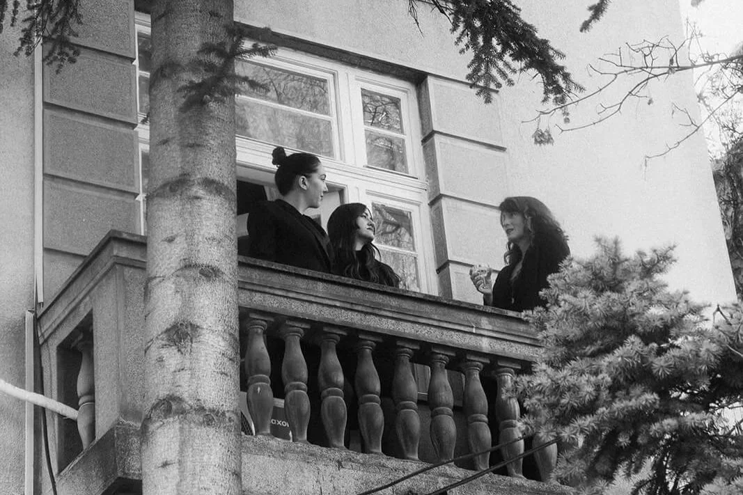
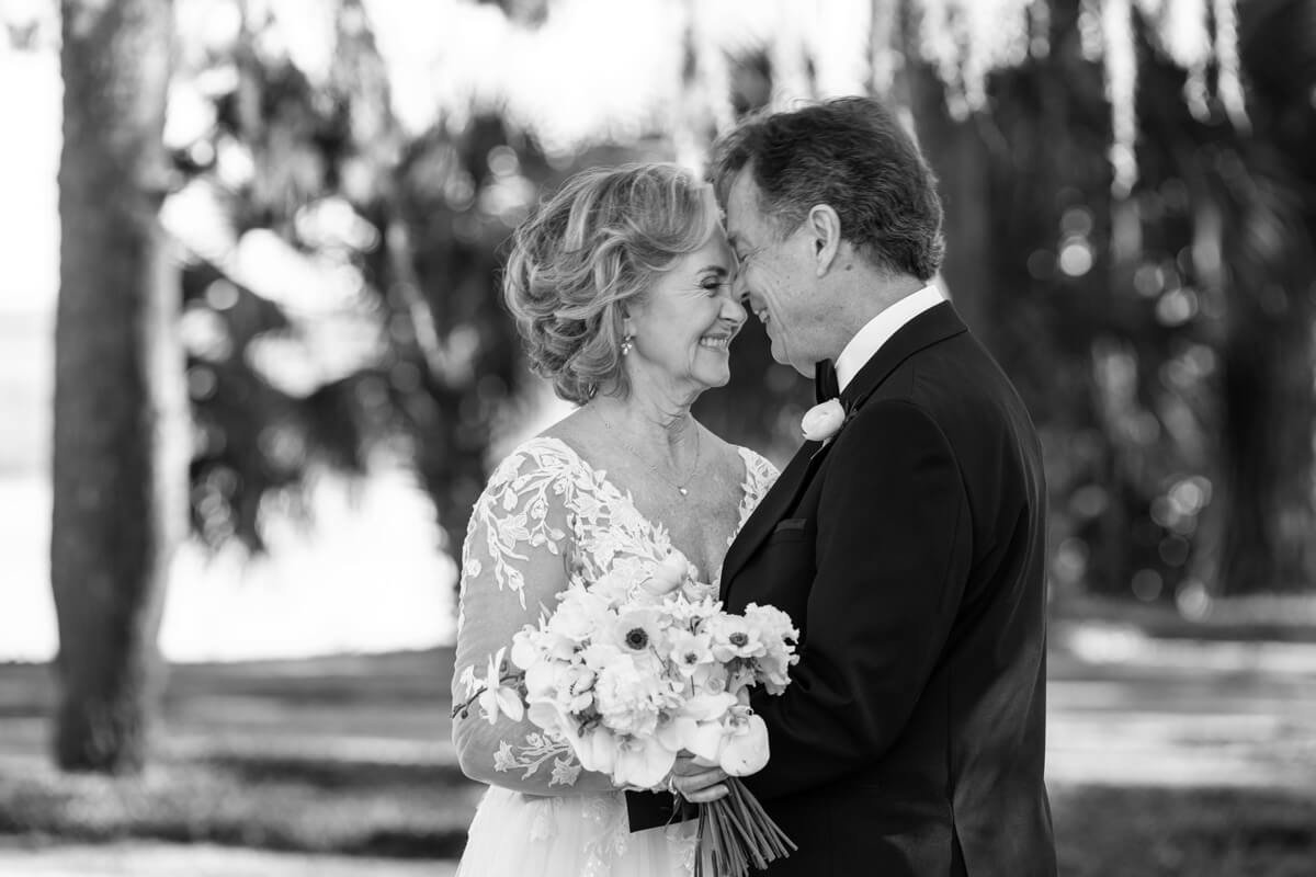
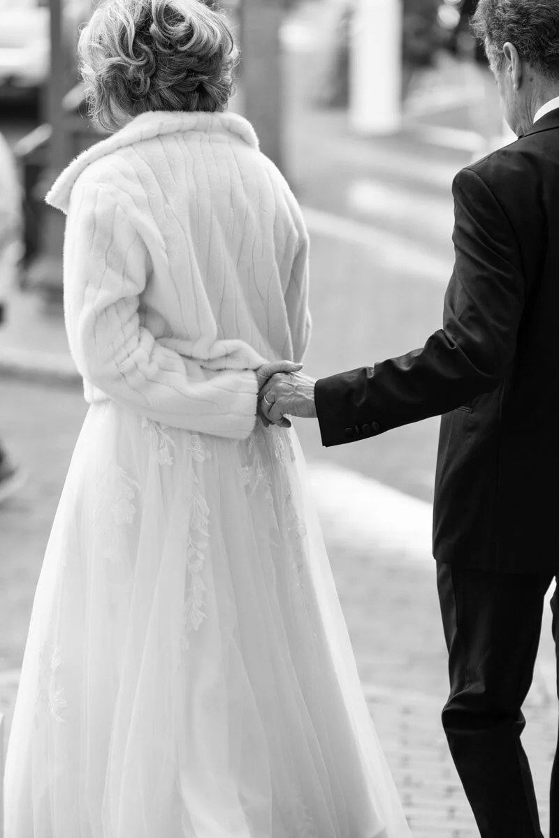
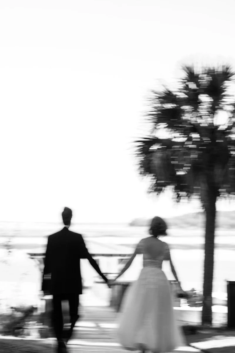
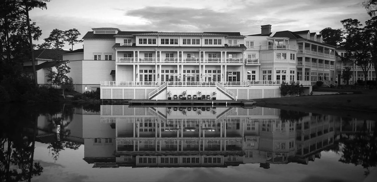
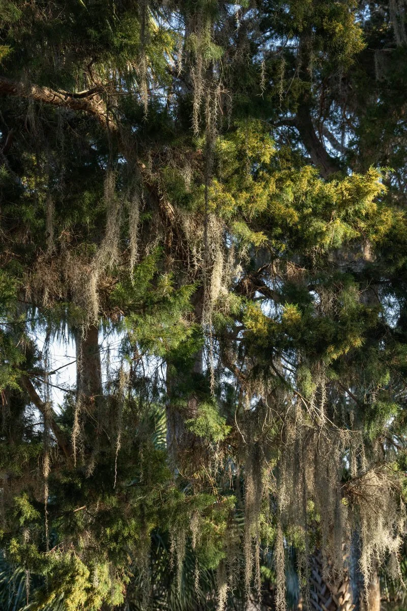
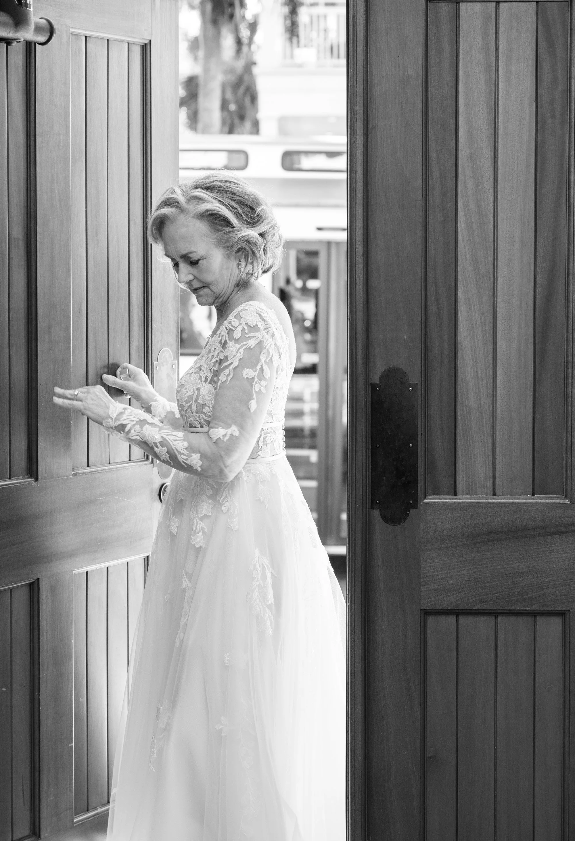
Trudi and Tom chose Palmetto Bluff for a long weekend that felt less like a wedding and more like a gathering of a beautifully lived life. Beneath the live oaks and Spanish moss, surrounded by decades of friendships and shared stories, they celebrated their love with intention and grace.
Some love stories take their time. And when they do, they tend to know exactly what they’re doing.
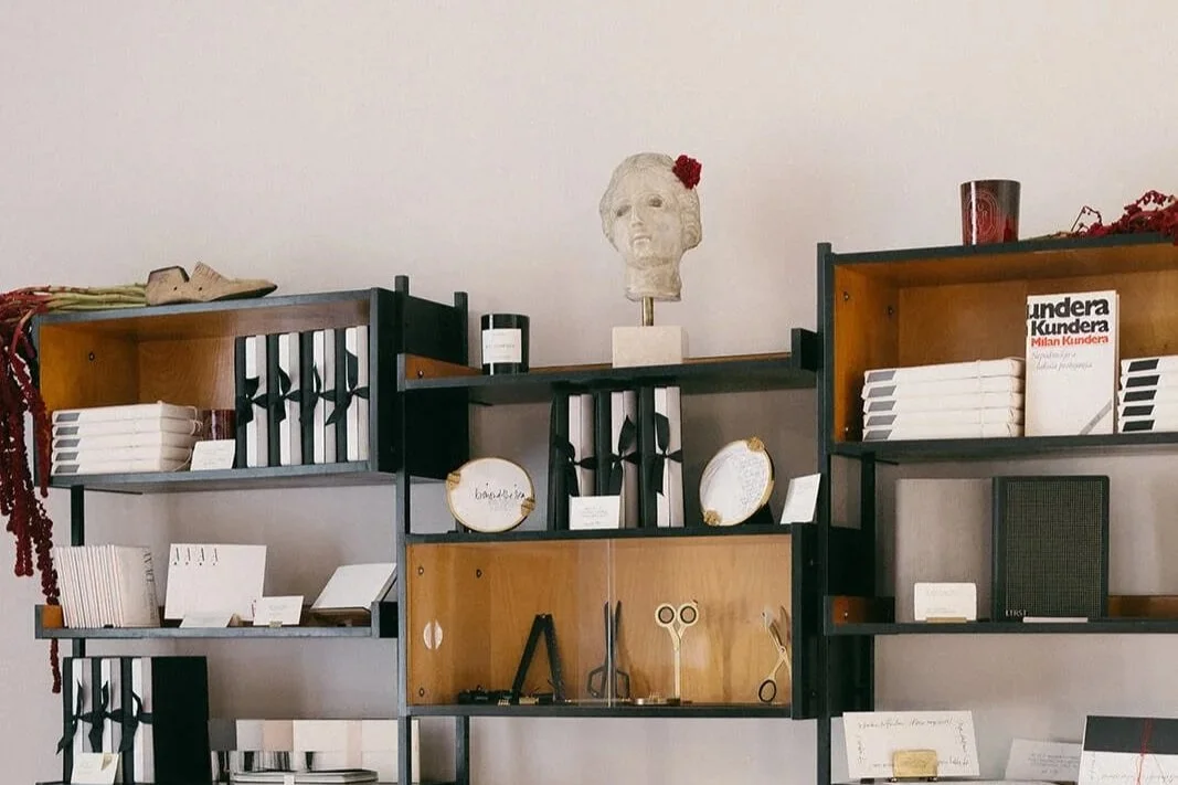
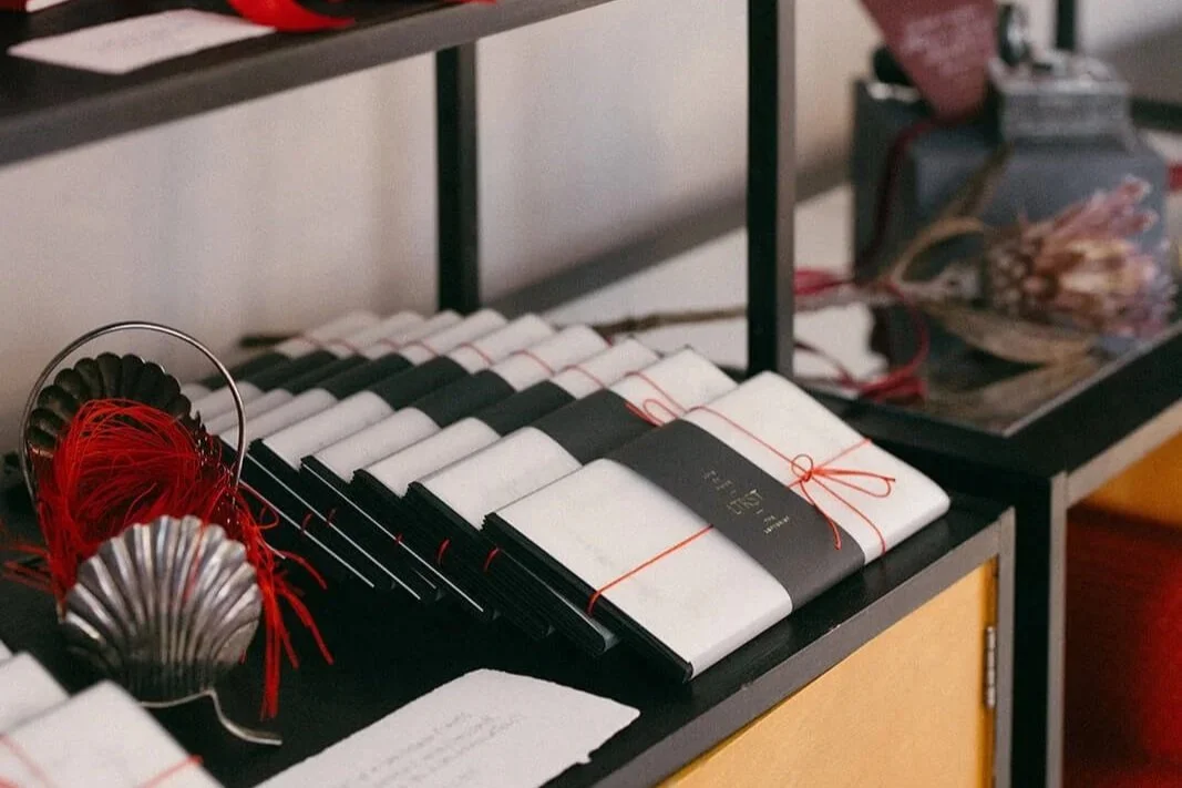
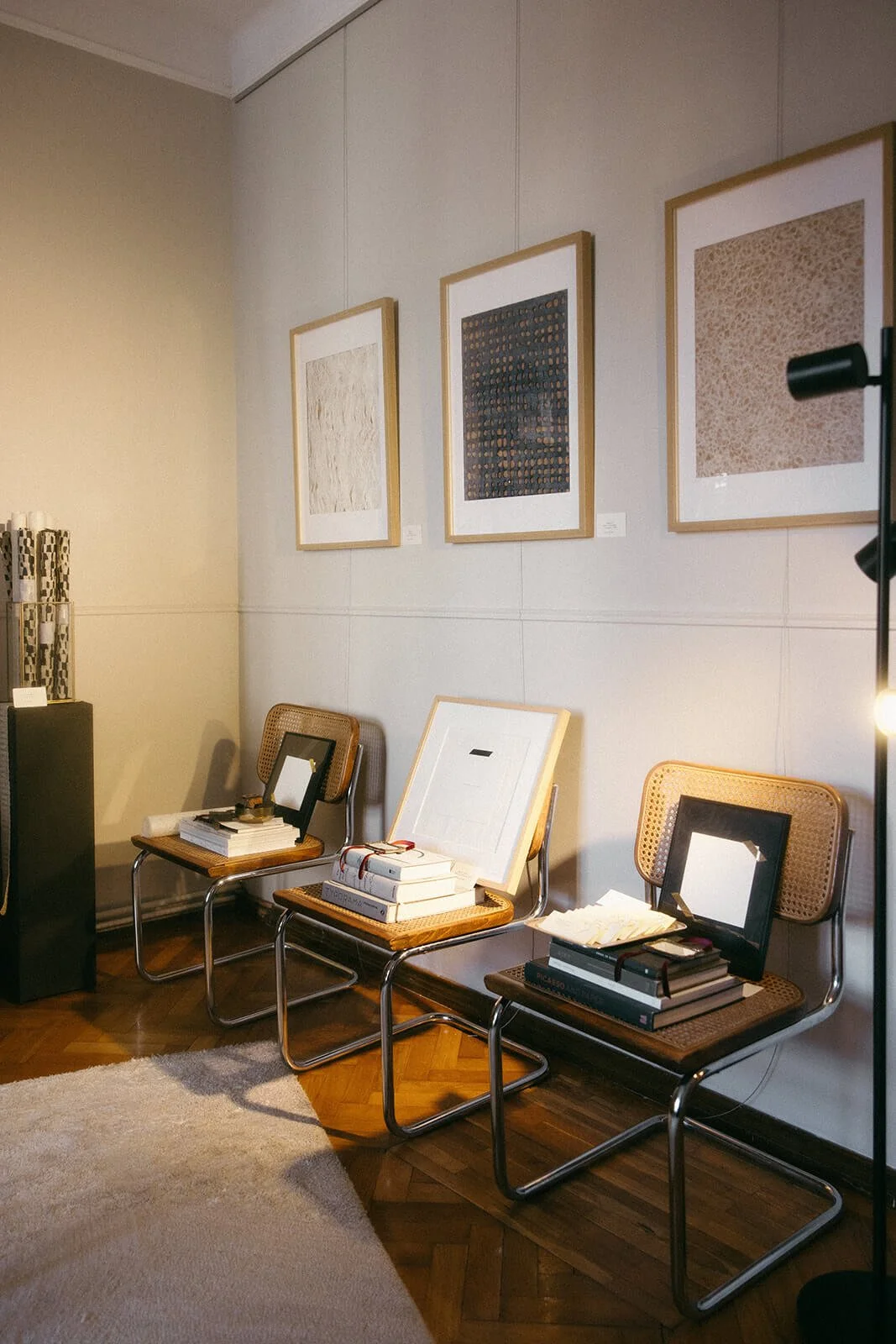
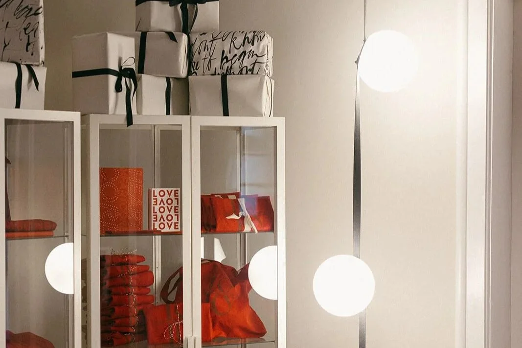
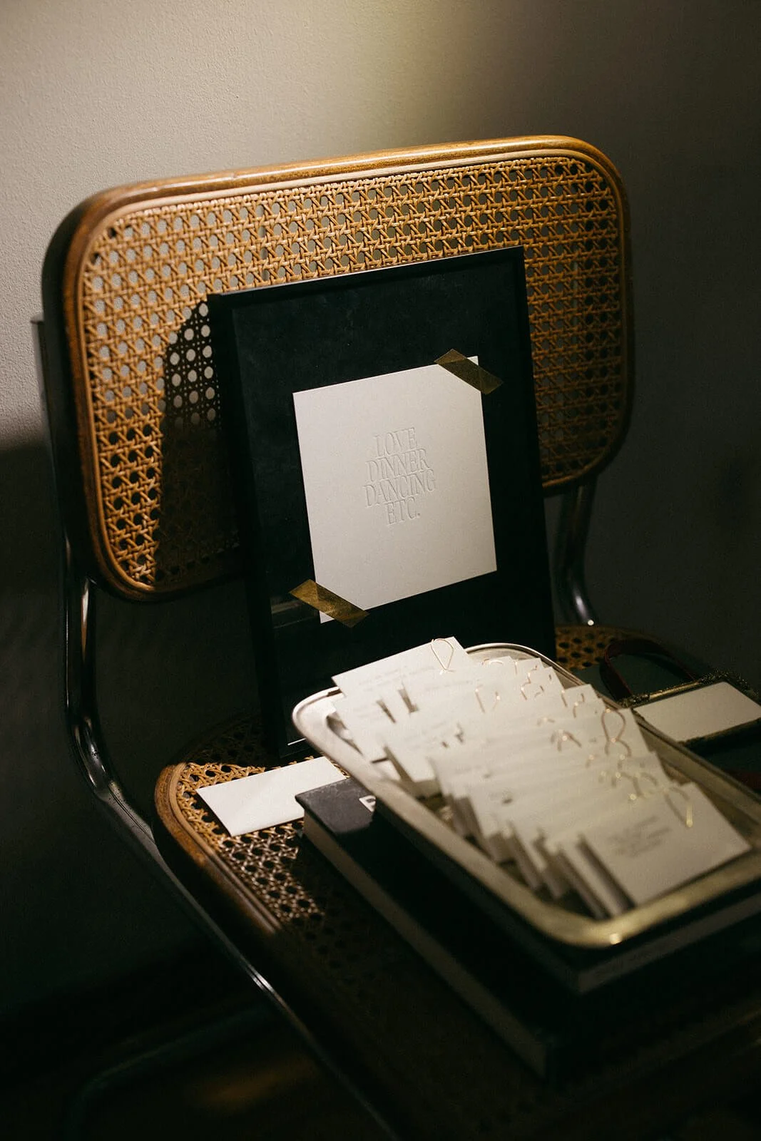
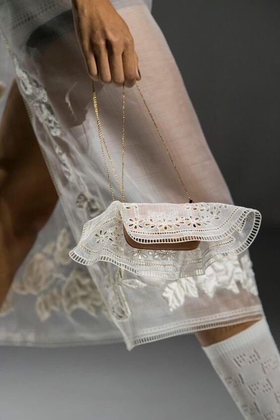
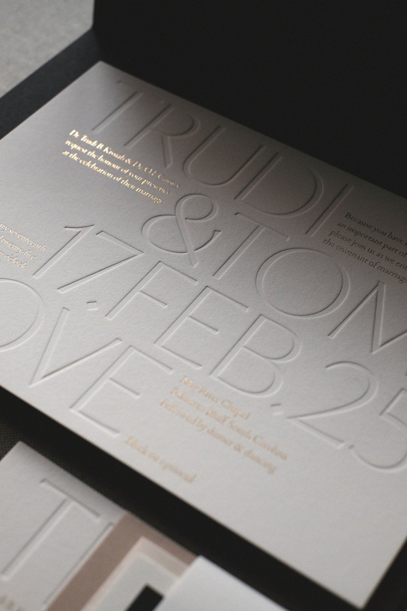
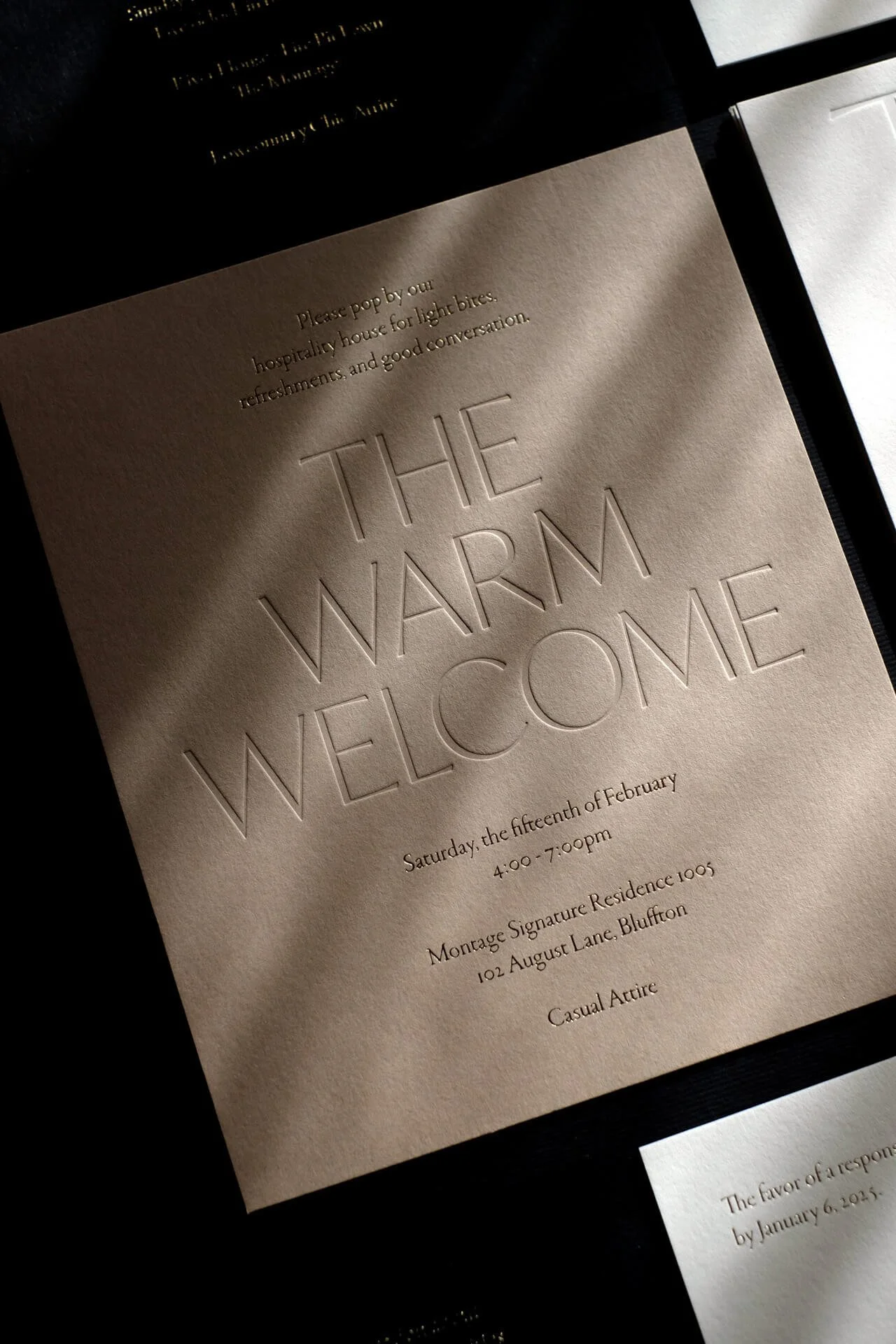
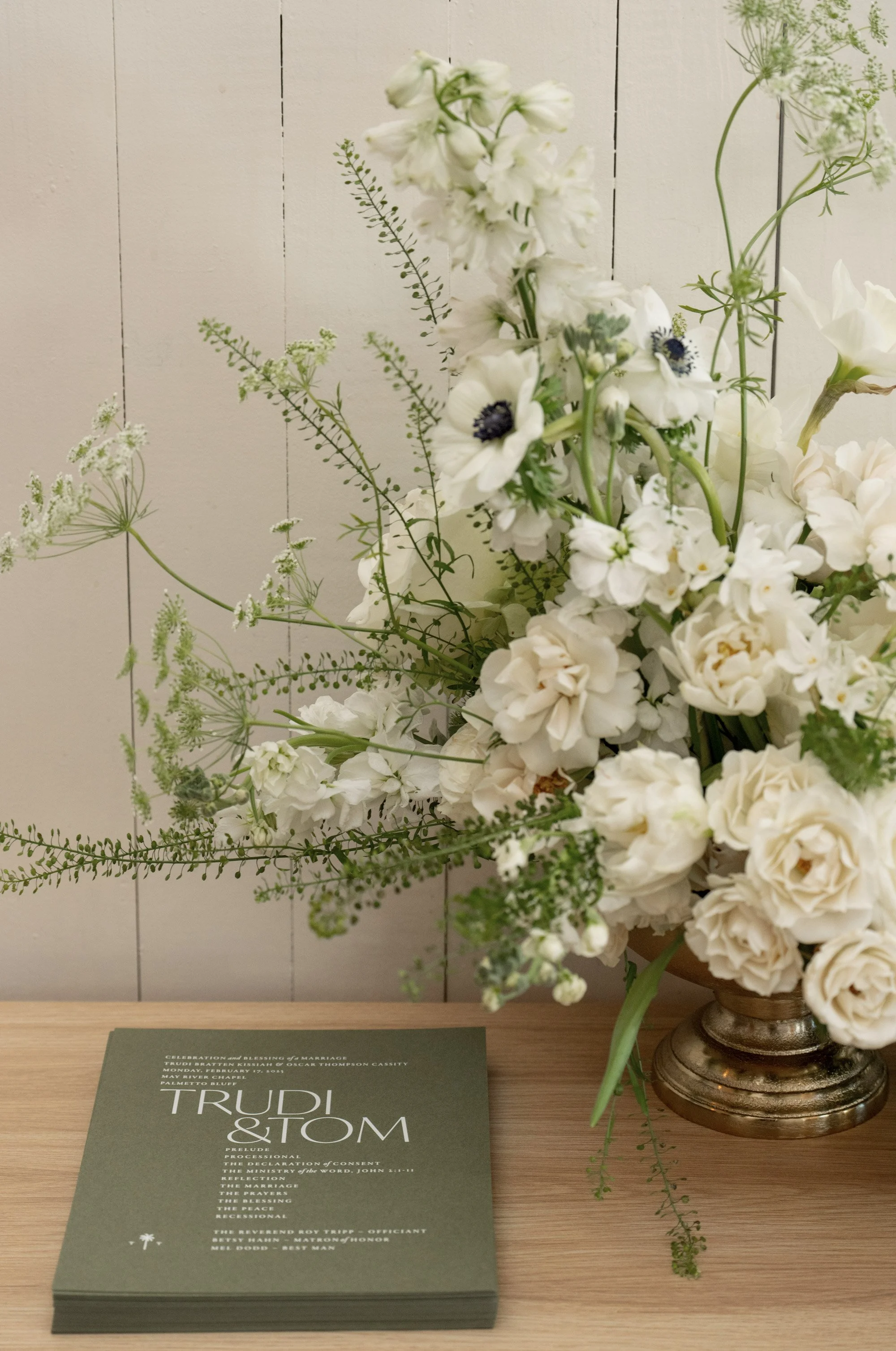
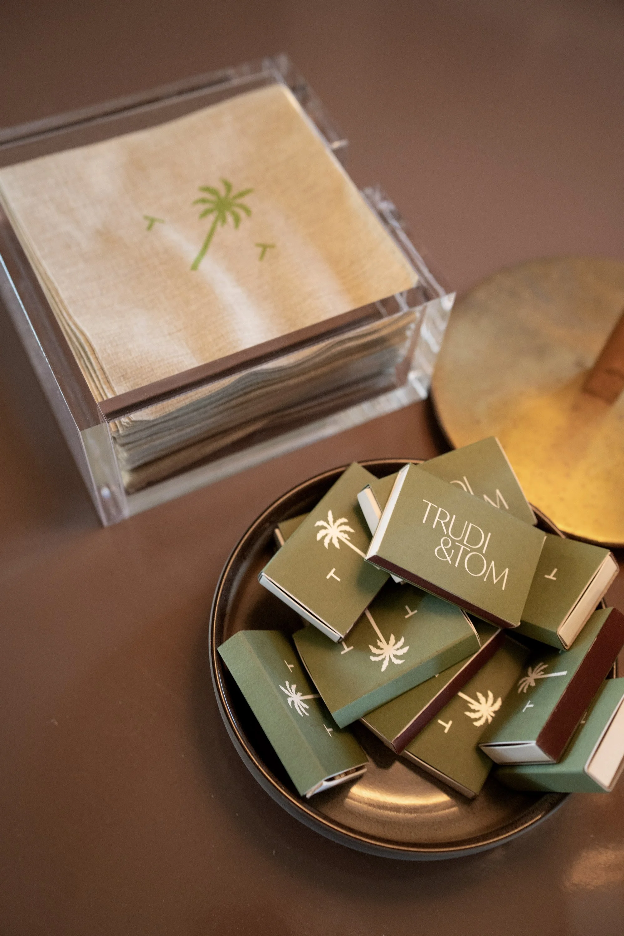
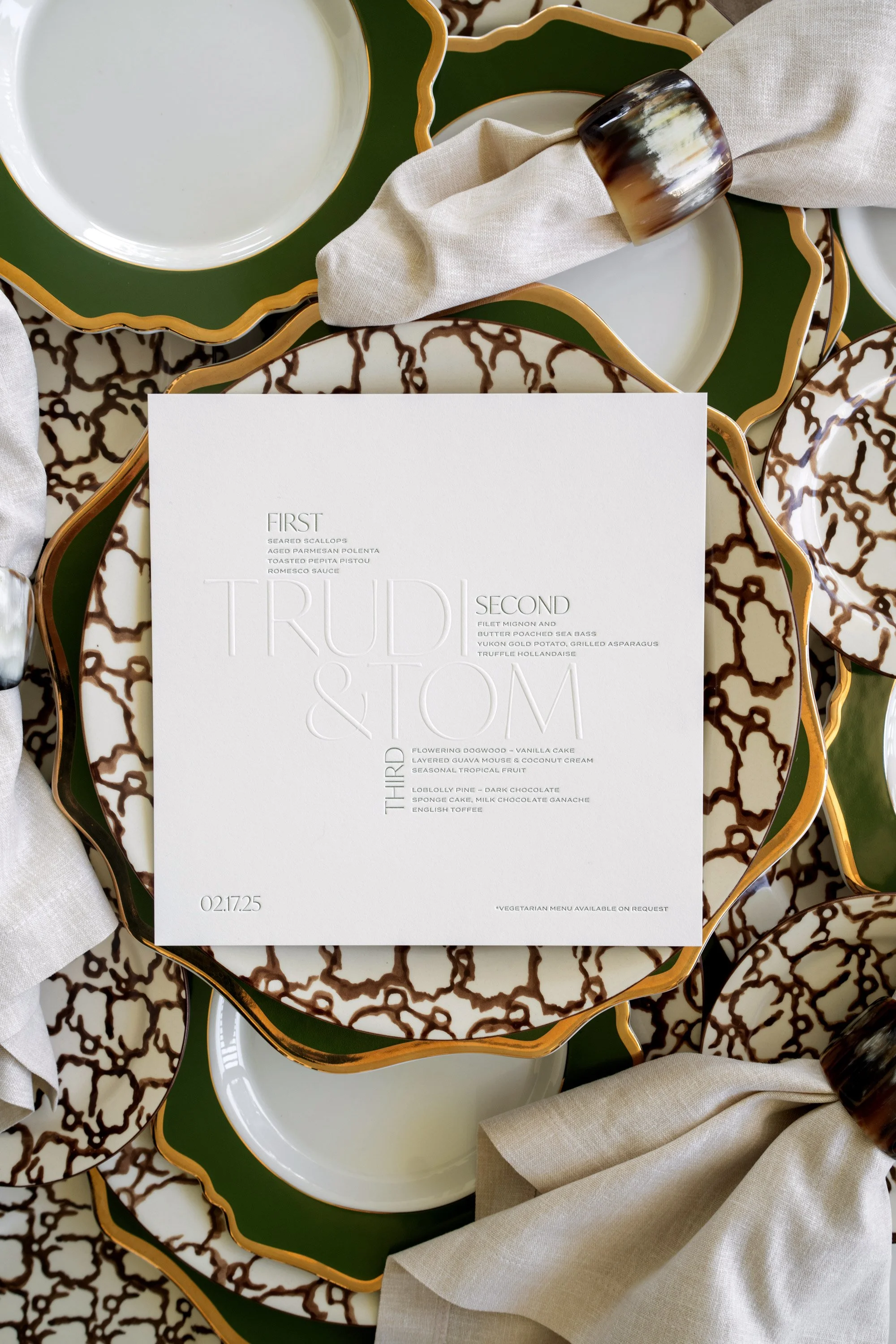
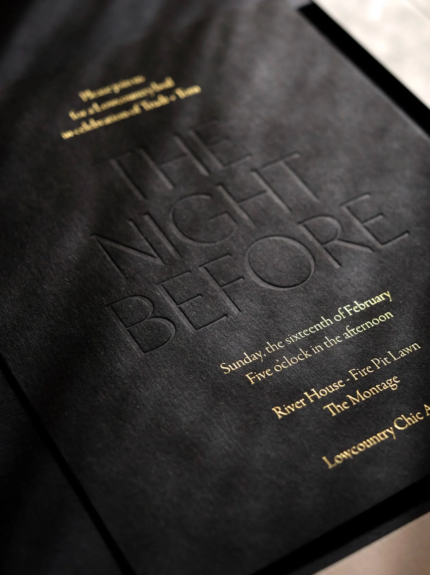
A beautifully tactile and monochromatic suite from The Dreamer collection, simple but unexpected typographic layouts, and green details inspired by the foliage of South Carolina…Trudi & Tom knew precisely what they wanted, and together with the brilliant team at Tara Skinner events, we made it all happen. See full list of vendor credits at the end of the post.
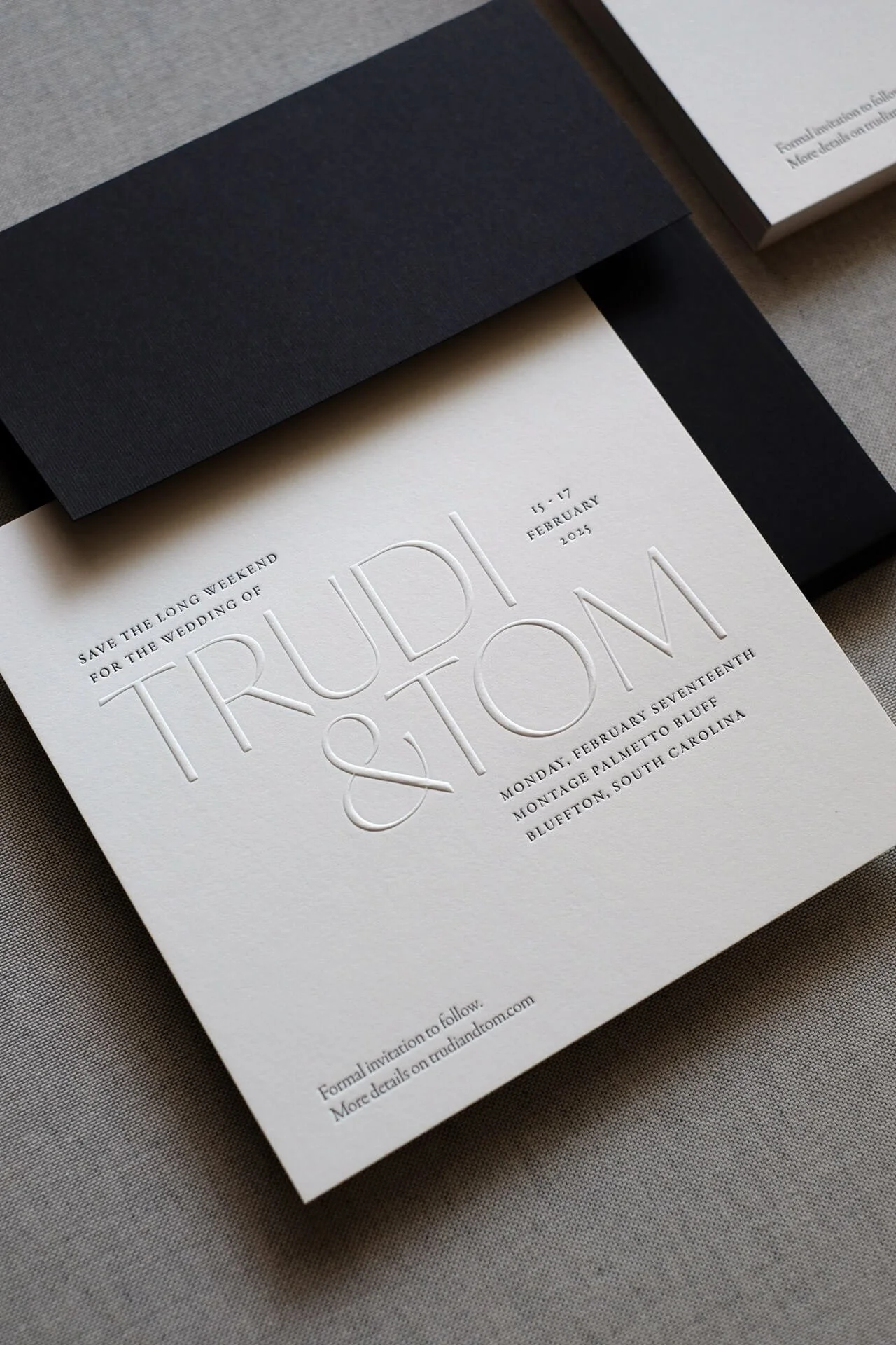
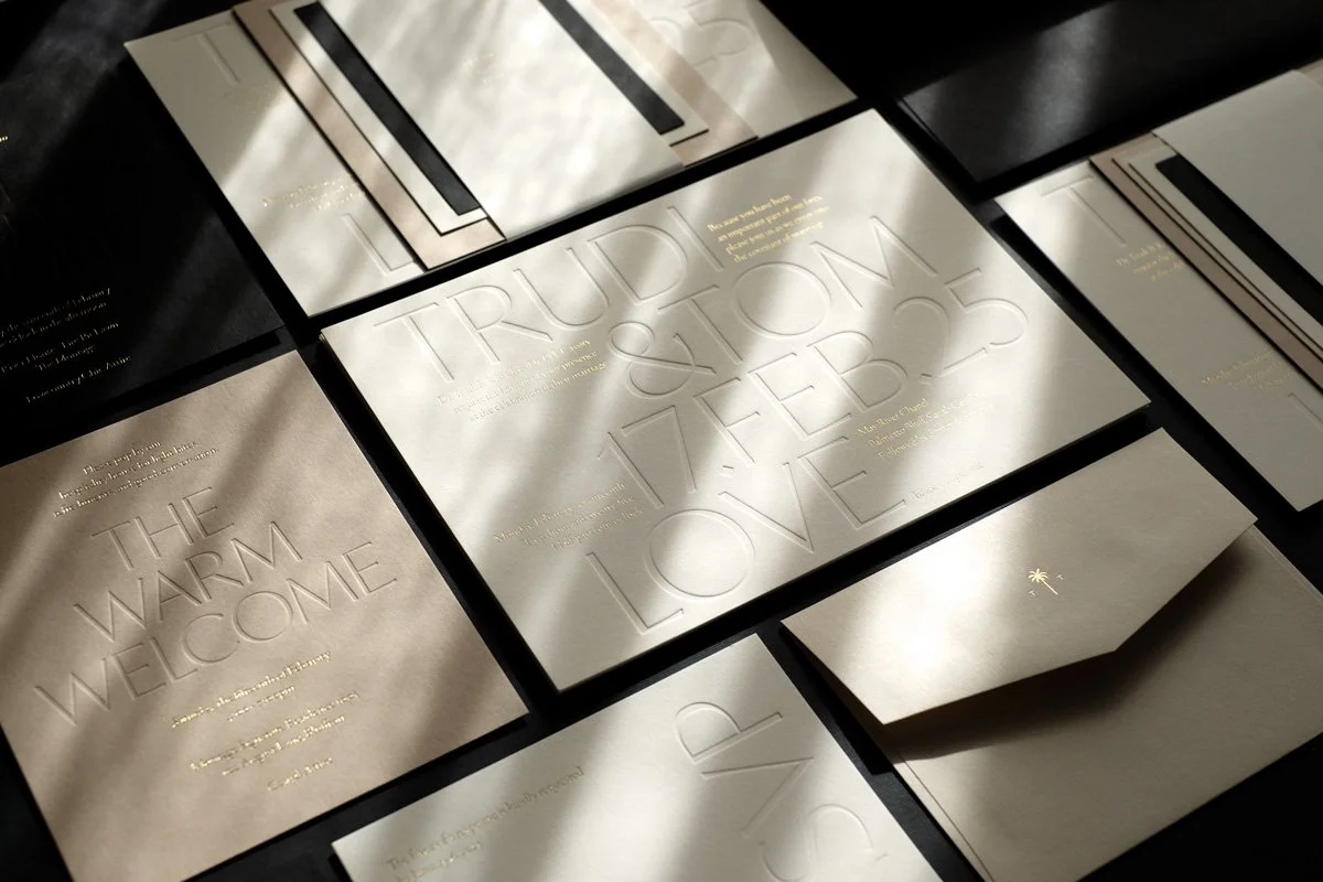
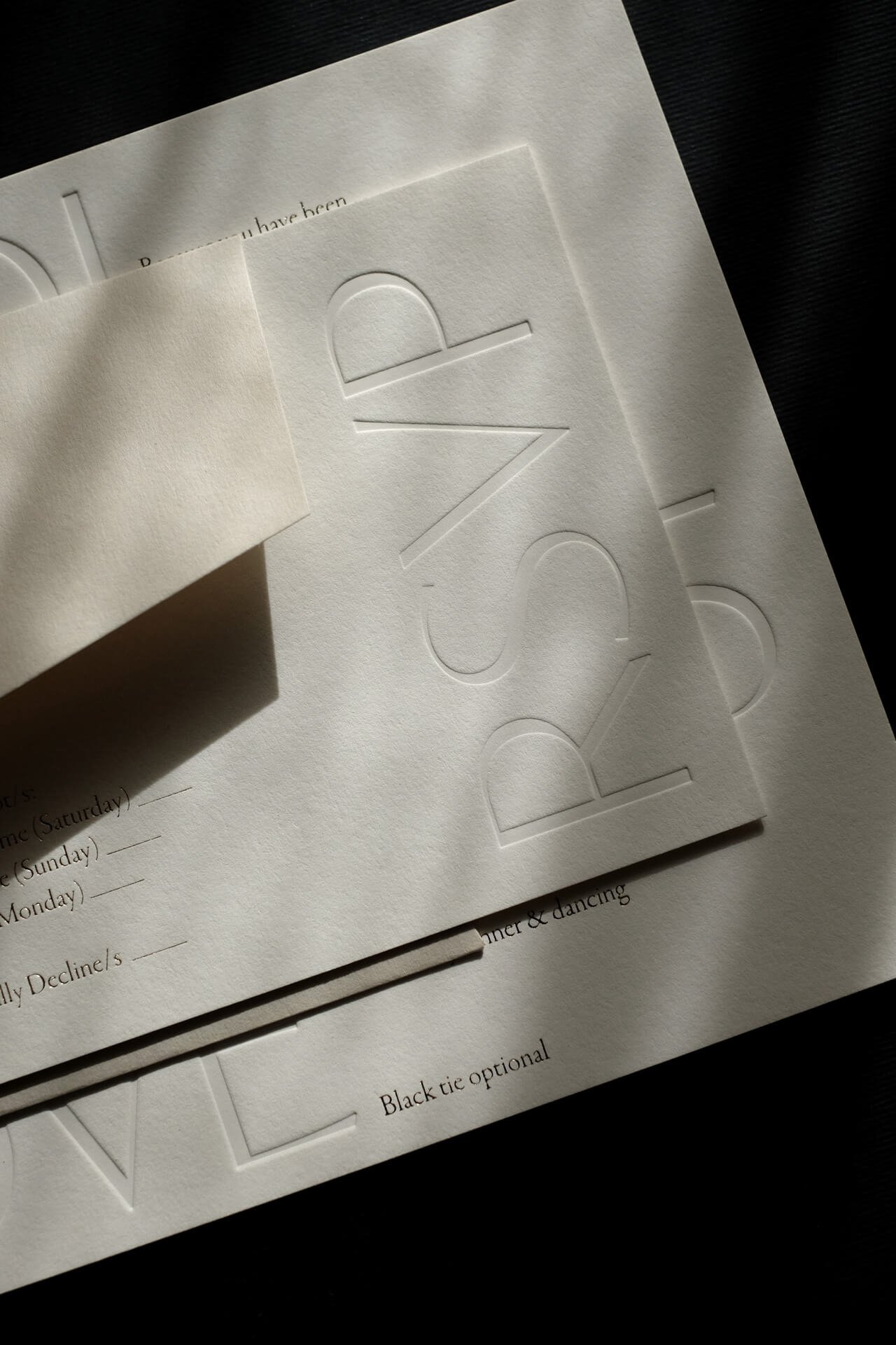
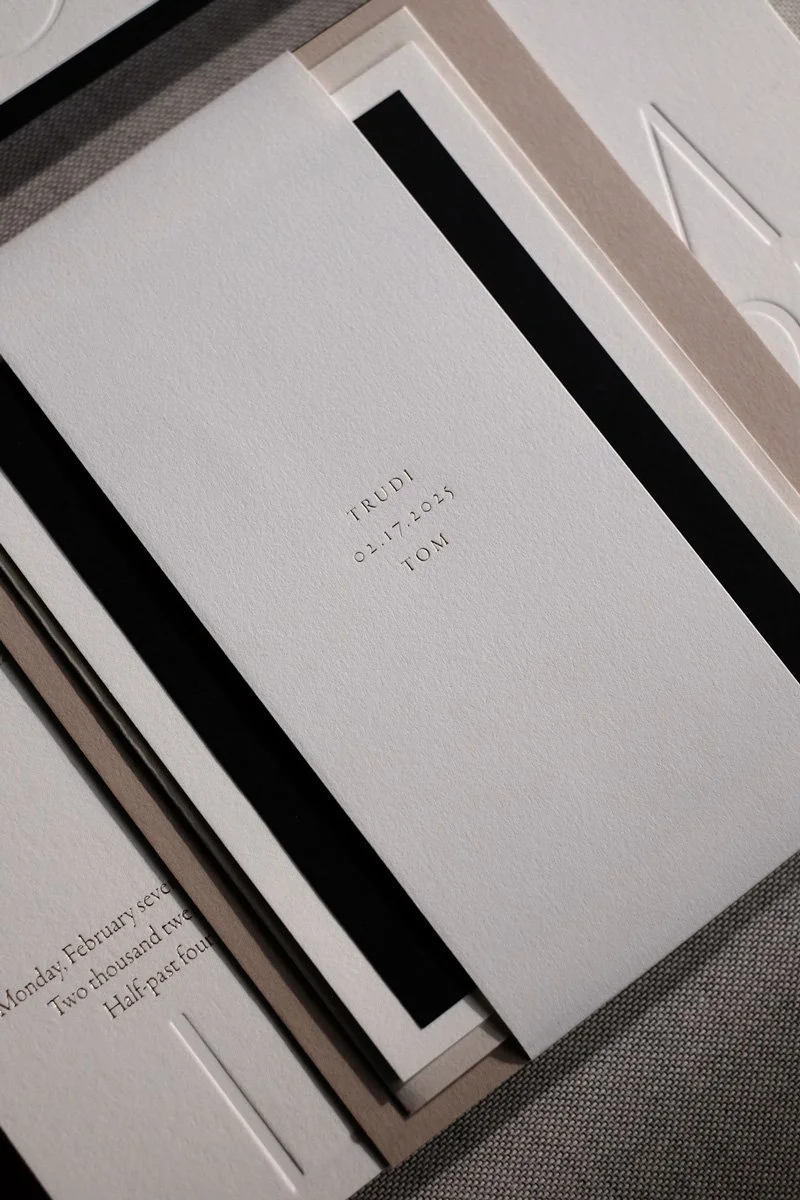
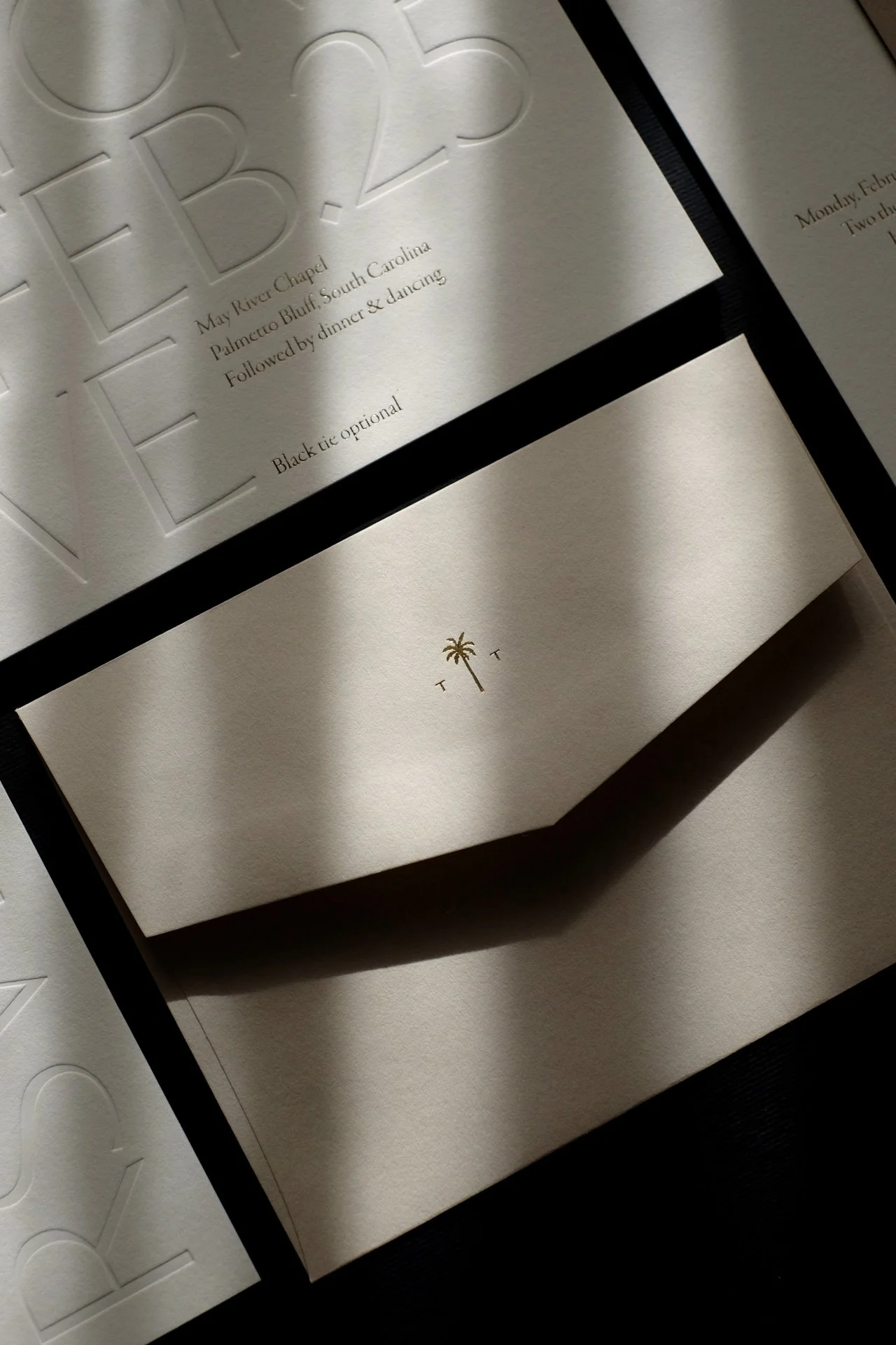
Stationery Design & Photography: Yours Truly - The Letterist.
Planning & Design: @taraskinnerevents
Event Photography: @kelliboydphotography
Venue: @montagepalmettobluff
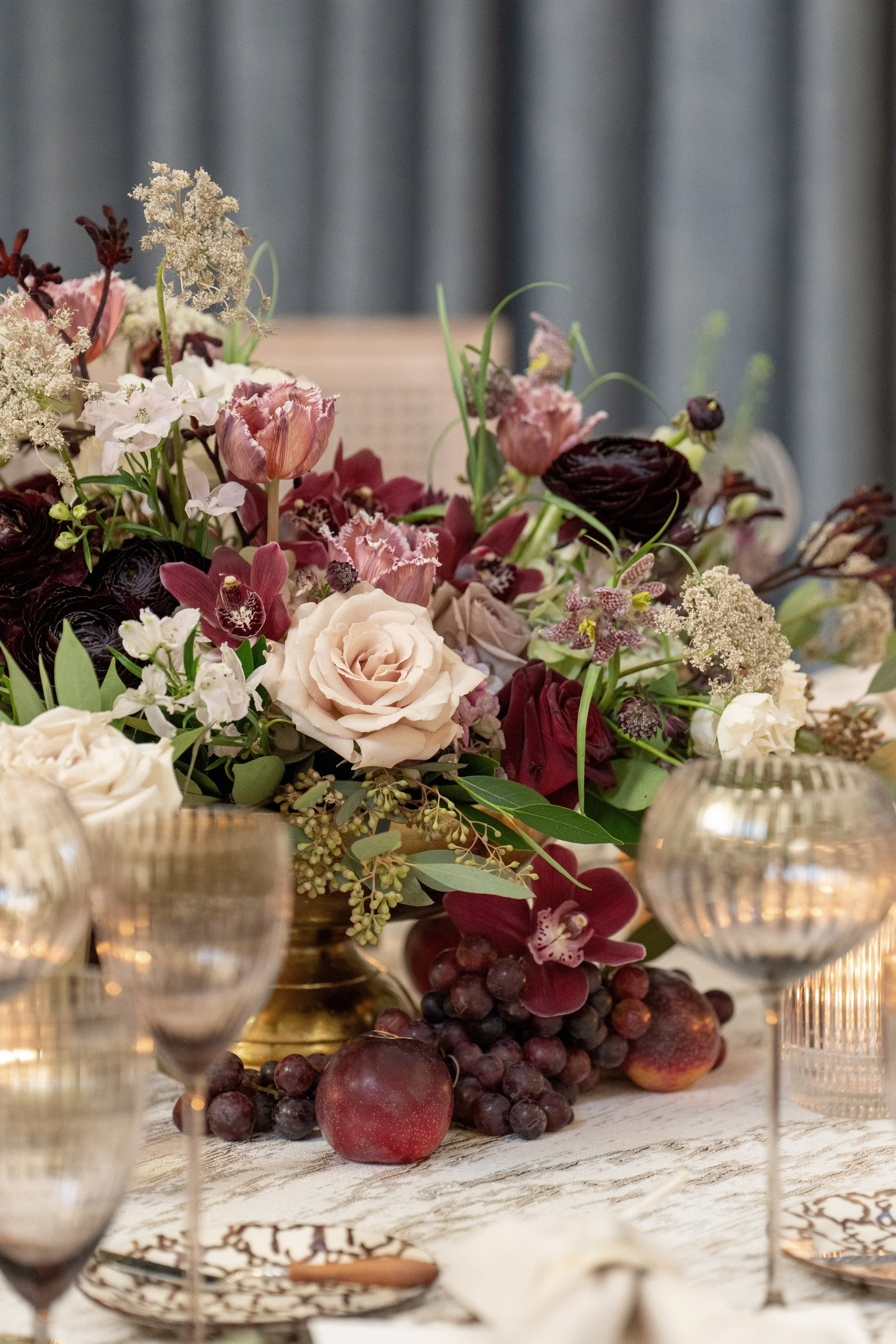
Florals: @augustdesign
Rentals: @amazingeventrentals @curatedeventscharleston @emersonjamesrental
Ceremony Music: @new_arts_music
Reception Music: @allaboutyouentertainment
Transportation: @old.savannah.tours
Linens: @bbjlatavola @nuagedesignsinc @reverie_social