
When you search for luxury wedding invitations or stationery - you’re likely to come across a plethora of examples which include at least one, if not all of these attributes:
Elaborate floral or decorative patterns covering large portions of the invitation, inserts, or envelope - and often involving specialty techniques and materials such as die-cutting or handmade paper
A multitude of inserts and additional finishing details such as pocket enclosures, envelope liners, inner and outer envelopes, wax seals, as well as decorative haberdashery elements such as ribbons, lace, or pearls
Traditional center-aligned layouts often typeset in old style serif typography or flowing script, as well as traditional invitation wording that includes parents’ names, spelled out dates or times, and formal phrases such as “The honor of your presence is requested” or “The favor of a reply is requested by…”
A lot of gold!
THE TRADITION OF LUXURY WEDDING INVITATIONS
Overall, the excess - in content, in volume, in different techniques and materials, is intended to illustrate the significance of the occasion (it is after all, called a big day, and it is traditionally, and hopefully a once-in-a-lifetime experience). It is also of course meant to make the recipient feel truly honored to be invited, and that a lot of time, energy (and often, necessarily handcrafted embellishments) have gone into the process. A machine hasn’t yet been invented that ties ribbons or attaches pearls or lace…hands, still, painstakingly do all of that.
There is often something decidedly nostalgic about such invitations. The introduction of age-old details such as wax seals and calligraphy harkens back to a time when correspondence was indeed entirely hand-crafted, and calligraphers sat for hours meticulously penning every single invitation. They serve as an homage to both the art of traditional correspondence and of weddings or other ceremonies and societal rituals in general.
But they also often recall particularly patriarchal traditions - which of course, vary greatly both geographically and historically - but in Western culture largely meant that this was an event organized and hosted by the bride’s parents to announce (or advertise) the betrothal of their daughter - and her soon “belonging” to another family. And so, they tend to be in appearance (with all the lace and pearls and frills) rather traditionally feminine - or stereotypically “girly.”
RETHINKING LUXURY WEDDING INVITATIONS
When we began thinking about creating a luxurious wedding stationery collection - The Dreamer - our aim was to retain the sense of honor and intentionality through meticulous craftsmanship, as well as the opulence or sumptuousness in appearance, but rethink luxury in a quieter, more modern, and more gender neutral way. Yes, yes, quiet luxury. We’re into it too. Here is how we reinterpreted it all:

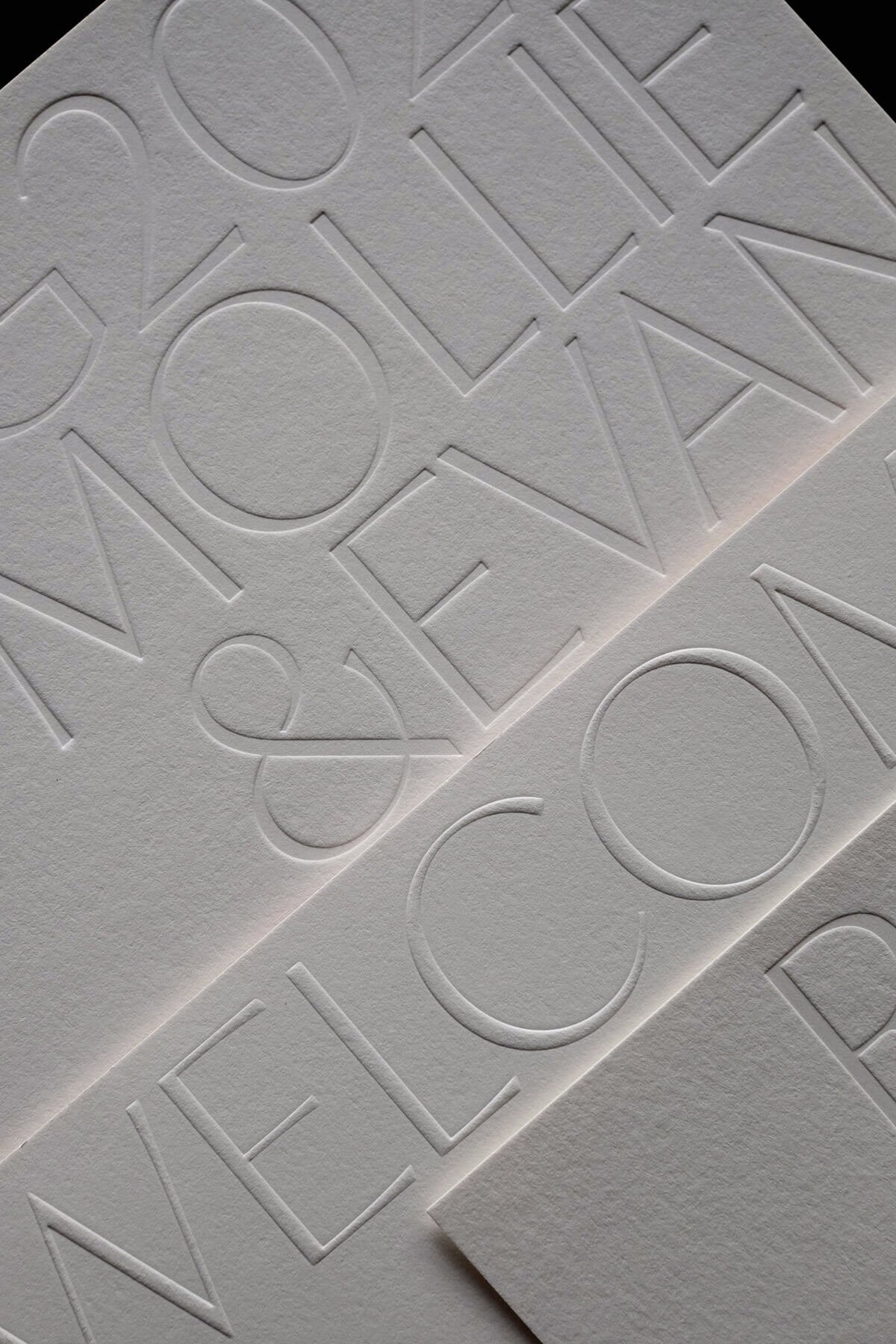
Luxurious debossed and embossed wedding invitation inserts from The Dreamer Collection.
Typography as pattern
Instead of elaborate illustrated decorative patterns, we decided to use only typography as pattern, impressing large words, names, dates, or details across the page to create a highly tactile and textural experience. Achieving this technically is no easy feat, so the meticulousness and craftsmanship is still as palpable and striking as it might be with a die cut floral enclosure.
CALLIGRAPHIC SANS SERIF
Instead of calligraphy or old world serifs, we used a modern sans serif font, that is less obviously feminine but reminiscent of (and inspired by) calligraphic strokes through its contrasting line weights. And because the print techniques rely on pressure, the varying thin and thin strokes achieve lighter and deeper impressions that further accentuate the tactility.

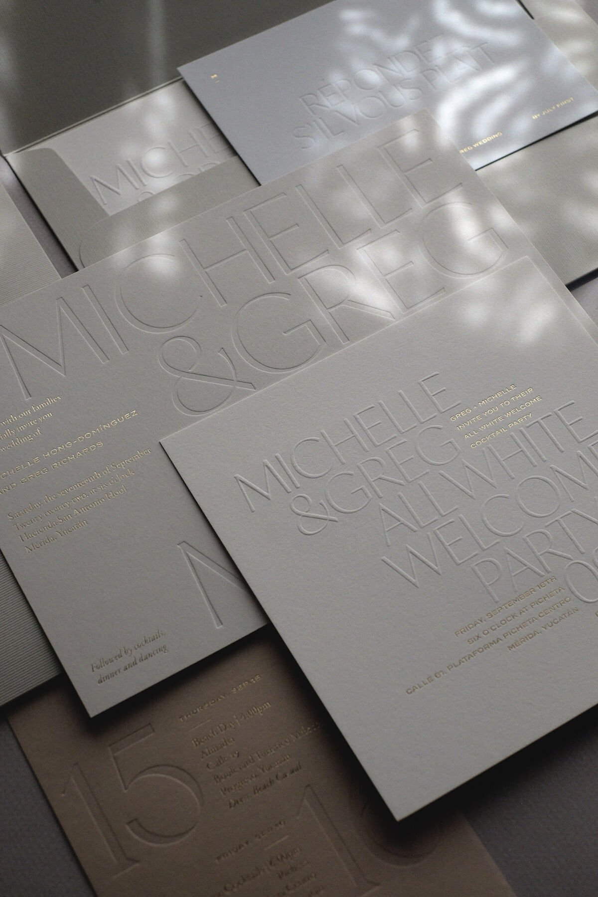
Luxurious cotton papers
Instead of adding haberdashery elements - we rely on a carefully selected palette of fine cotton papers to tell the story…and have on occasion added broad hand-painted acrylic brush strokes. These add more color, more texture, and offer a modern take on that handcrafted effort that makes every single invitation unique.
GOLD FOIL STAMPING
And we kept ALL THE GOLD. All the small type in this collection is foil stamped…and often times even purposefully over the large textural words. This adds a little something unexpected, and as it is often all typeset in an uppercase sans-serif typeface, also creates a more modern and gender neutral feel.

While we tend to always vote for modern and succinct wording…the longer traditional phrases could still find their place here, and create an interesting balance or dialogue between old and new. Parents are often the ones who are insistent on using traditional wording, so this collection offers a neat way to keep everyone happy. If your parents are not involved, and most of your guest list is younger…feel free to shorten and sharpen it up! Or leave it to us to suggest modifications. Because this collection is so typographic, the length and layout of the text content plays a big part in achieving the overall look.
When it comes to the large decorative type in the background…here, anything goes! We have most often done some combination of names, dates, and some detail of the address…but it could all be a long poem, perhaps a repetition of the word love in several languages…whatever you dream up! Let’s get creative and try a few things out. It’s a bit of a tetris game seeing what fits best.
Find out more
If you like the look and sound of quiet luxury, wander over and take a closer look at The Dreamer collection. You’ll find more examples and details on the various elements in this collection, as well as our styling notes, a moodboard, links to weddings that featured this collection, and so much more.
If you’re interested in Save the Dates, Wedding Invitations, or Day of Stationery, please get in touch!