
As a typography-focused wedding stationery designer, one of the first things I look at when we receive an enquiry are the words and letters. I scan through the names, dates, venues and addresses looking for something that might stand out - words or numbers I can immediately visualize and imagine looking great in a particular typeface, font size or layout in one of our collections. I get excited about names like Quinn & Braxton - a Q, R, X, and ampersand are a typographic feast! I like dates that are “tidy” - like 04.04.24, or ones with lots of curves in them, like 06.09.25. I like twos and threes and eights. Oh, eights! I love long and foreign names…and as far as I’m concerned, the more glyphs, the merrier. I love tightly packed letters and lines of text, so glyphs always present an interesting design challenge in getting everything to slot together nicely.
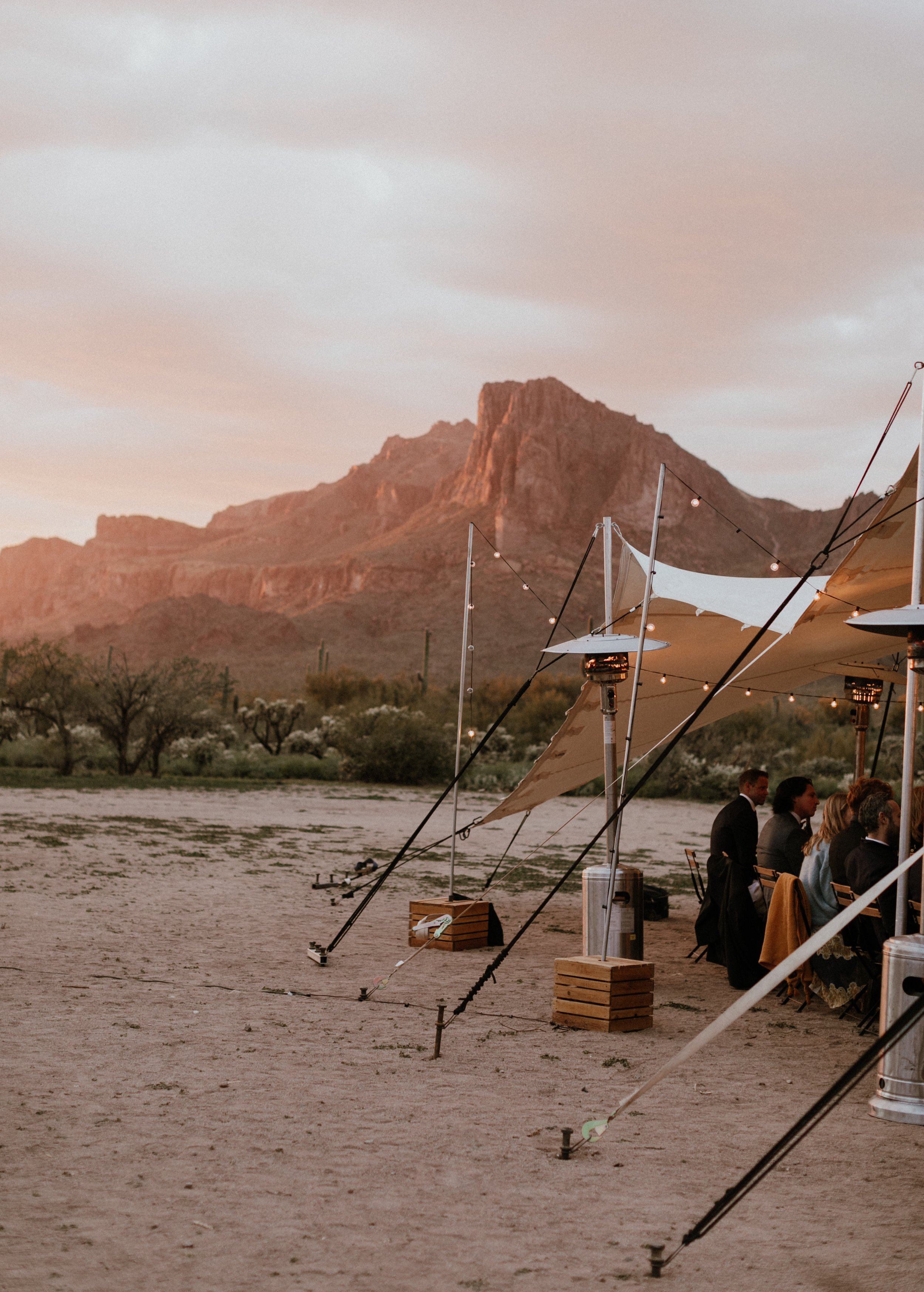
All of which is to say, this project - from the minute I laid eyes on the enquiry, was a dream. The wedding venue was in the SUPERSTITION MOUNTAINS. The welcome dinner was in, come on, PARADISE VALLEY. And the groom was Swedish, so they politely asked if we could do a dual-language version of the invitation, in English and Swedish. Swedish is glyph city!
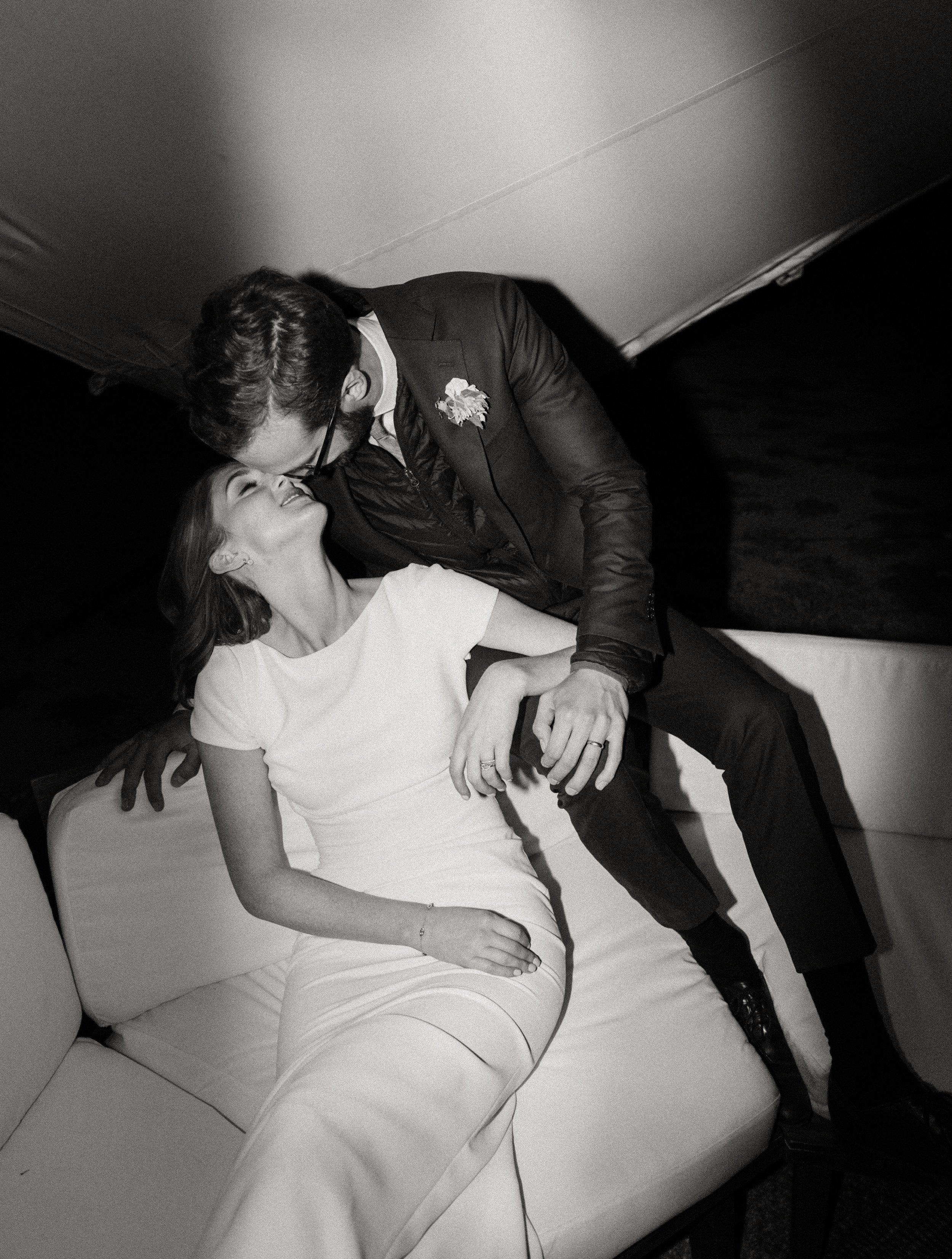
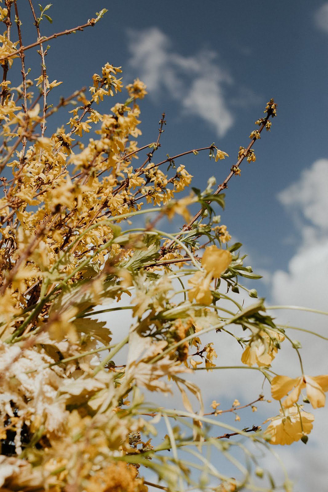
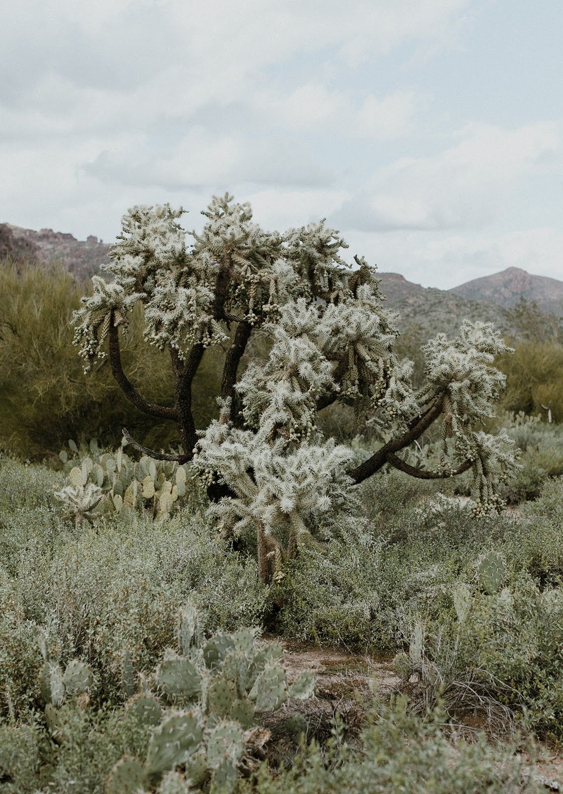
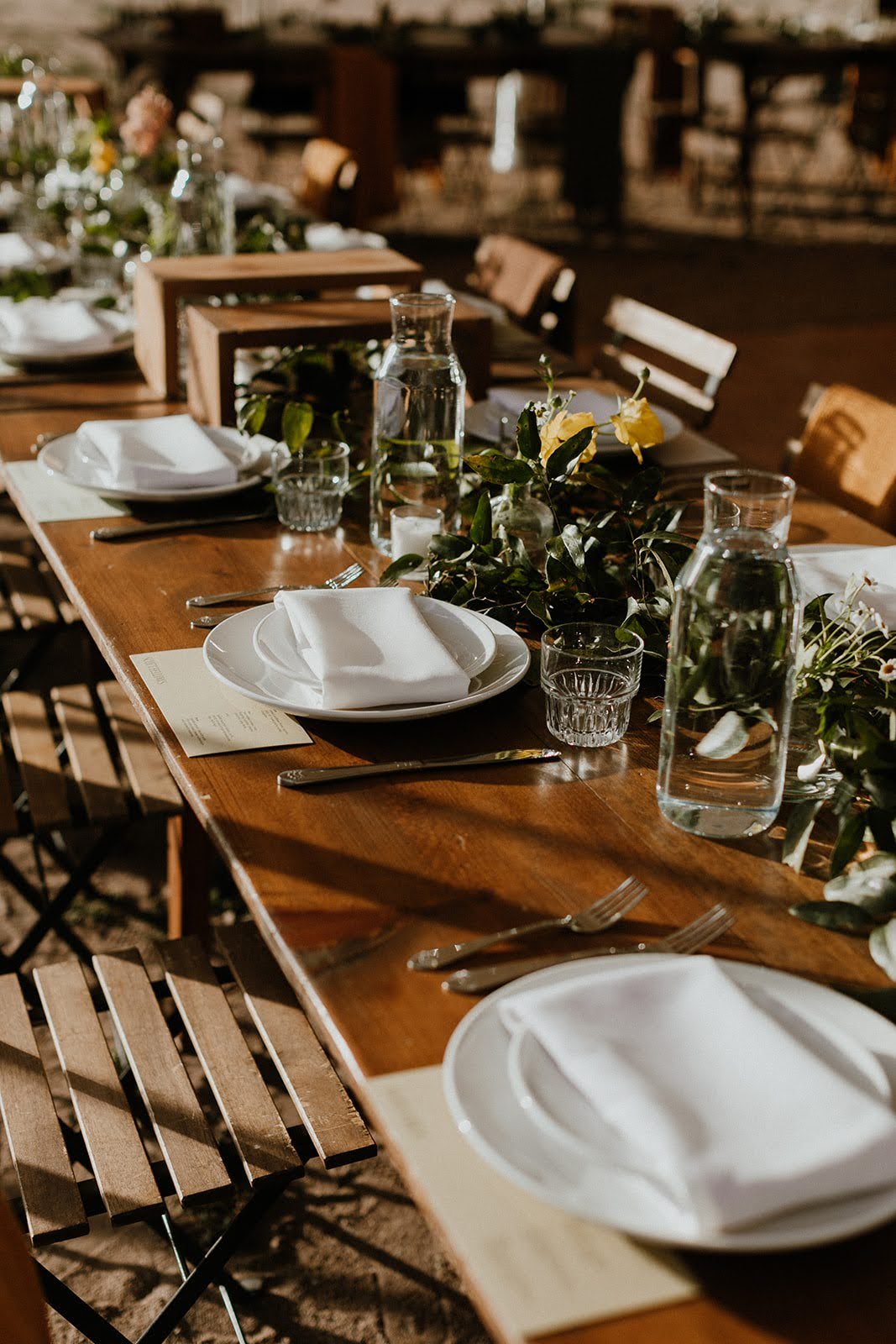
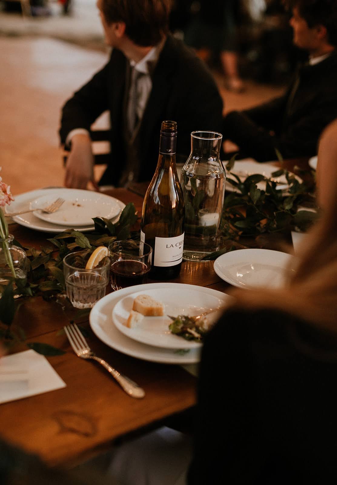
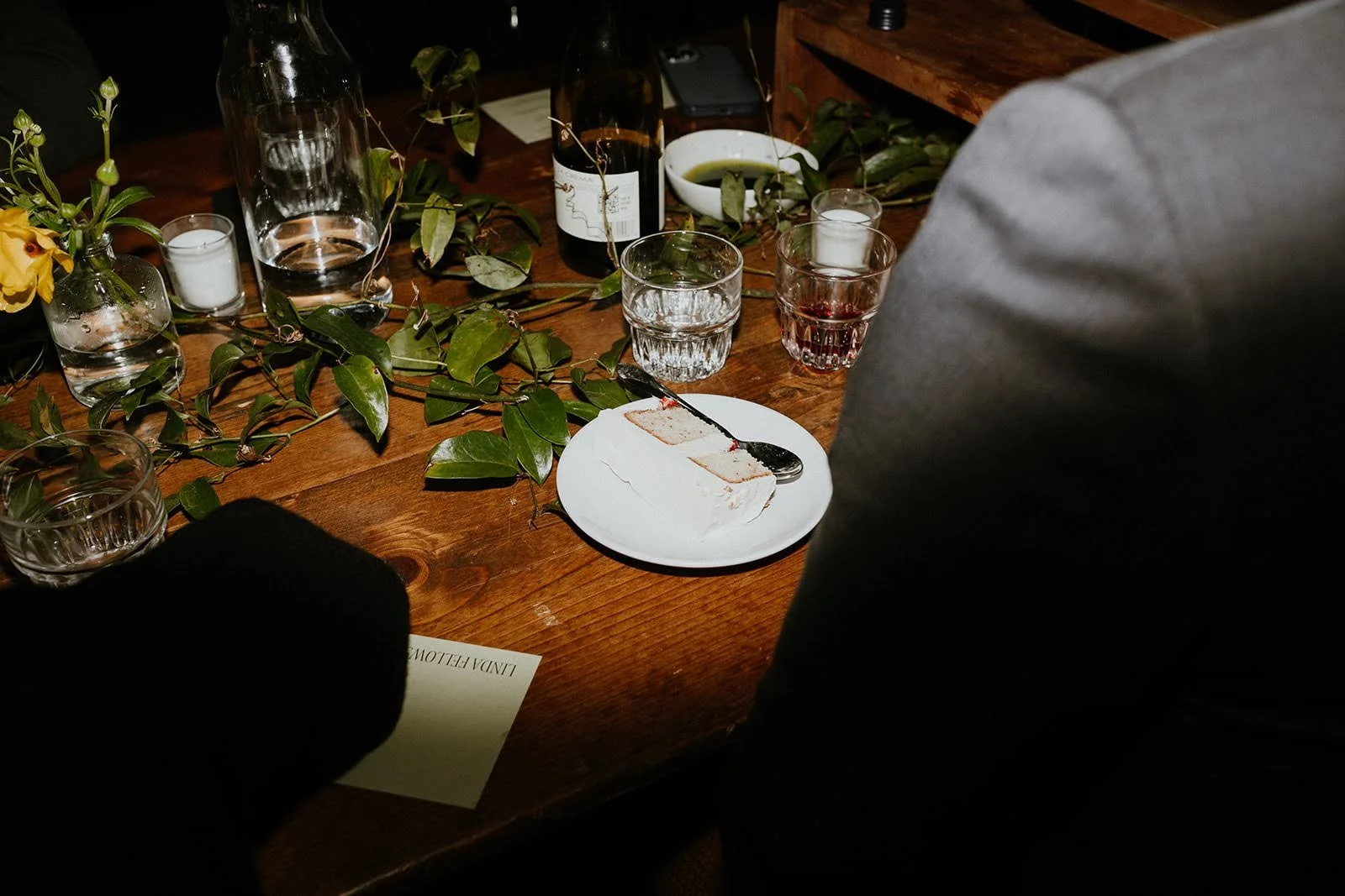
As if that weren’t enough, they then introduced me to this concept of “desert friendly formal” - which was their dress code, but also sort of became our stylistic and color palette direction. To this day, it is one of my favorite color palettes and wedding stationery projects we’ve worked on…and when I saw the photographs from the wedding, I was just blown away with how beautifully and consistently every piece of it came together. There was desert, there was friendly, and there was formal.
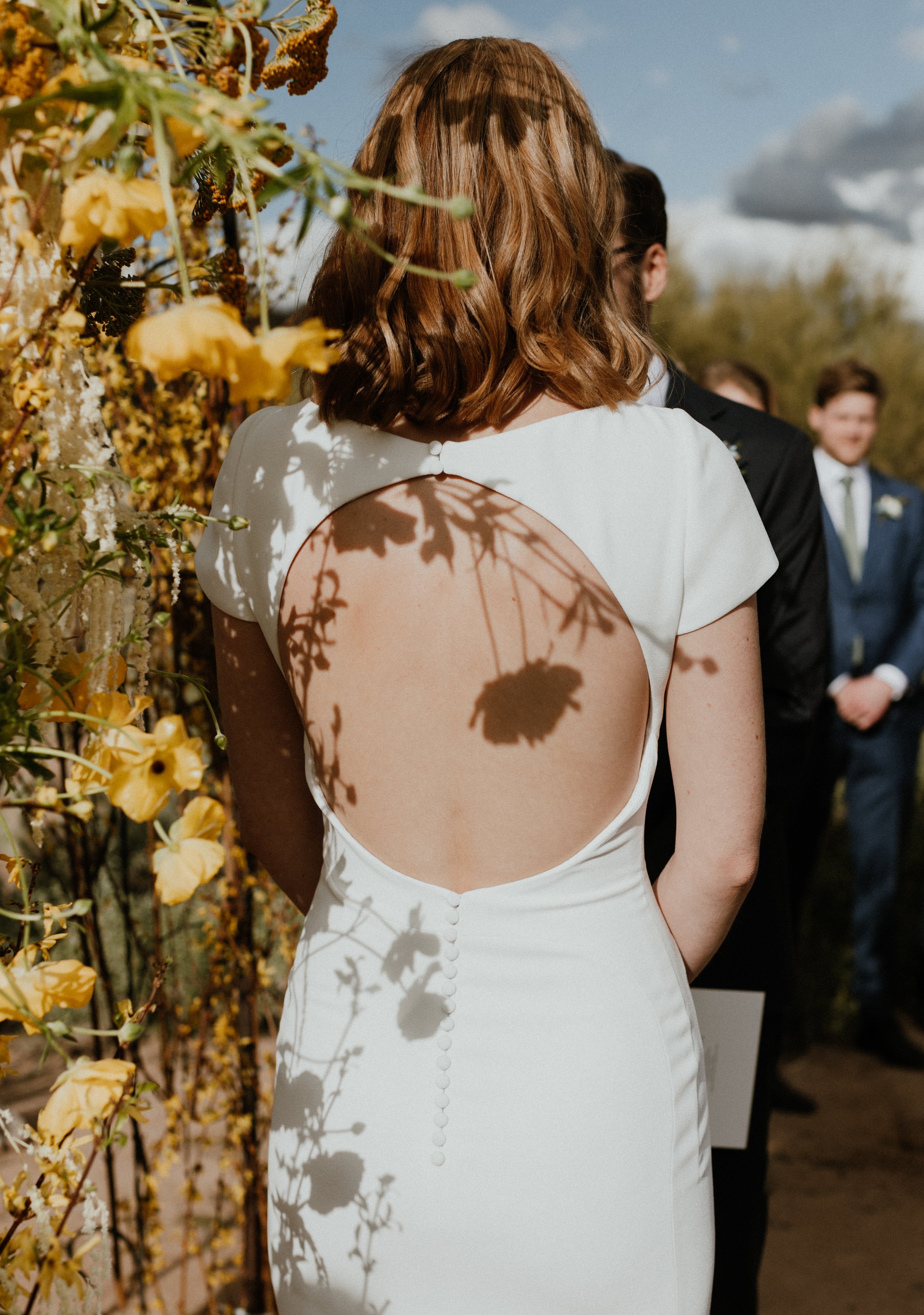
Scroll through to see more of this elegant and unique spring wedding in Arizona. The photographs are taken by the talented Alisha Tova. Follow her on Instagram, or visit her website Tova Studios. Devin’s stunning backless dress is from Pronovias, and Viktor’s slick suit from Blugiallo.


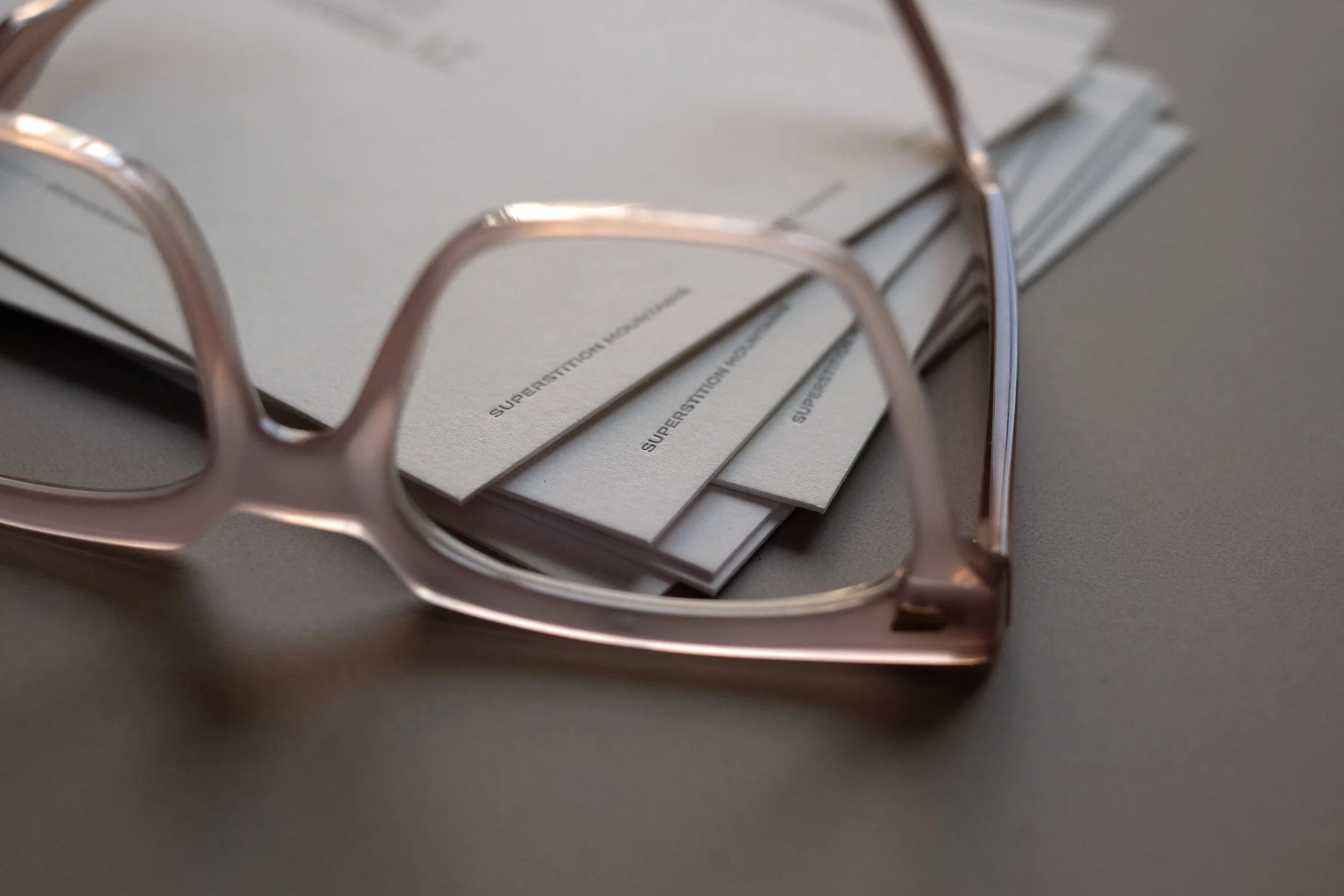
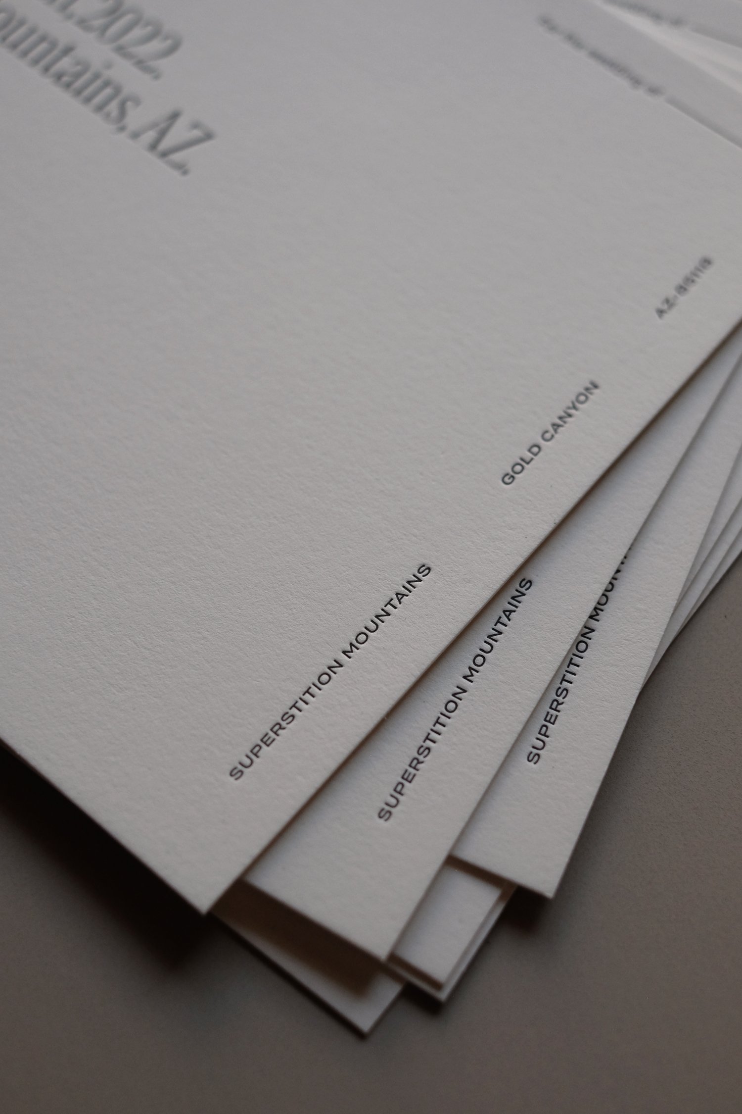
To set the formal and elegant tone, the Save the Dates were printed in classic black letterpress on a soft-ivory pure cotton paper stock. And speaking of letters slotting in together nicely, how lucky did we get with the lowercase “y” in Saturday landing right in between the two dots on the i’s in Superstition! The sentence case in this layout sometimes presents challenges when ascenders and descenders or tittles collide - so we sometimes have to get creative and reword things if necessary. “The fifth of March,” would’ve been one solution - a short even phrase without descenders. (A tittle by the way, is the technical term for the dot on a lowercase i.)
Getting to repeat the location in uppercase in the right hand-margin was just icing on the cake. The envelopes opened on this side, so when guests received and began opening their envelopes - this striking location was the first thing they saw:

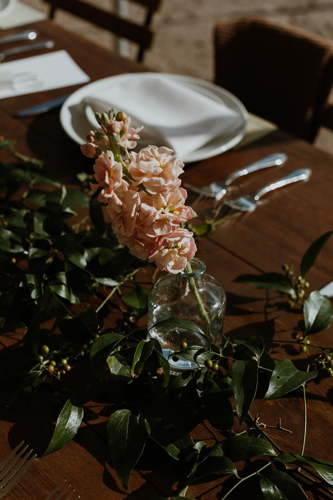
When we got around to working on the invitations, we decided to broaden out the color palette - including a rich brown, and dusty yellow and adding friendly and desert to the formal we already got across through the Save the Dates. The yellow paper was from Conqueror’s Bamboo collection and the shade - I love it when this happens! - was fittingly called Sahara. The brown stock is from Favini’s Crush collection - and called Coffee because it includes recycled by-products from actual coffee beans. Sometimes I wish we could include and insert in each suite just to explain the beautiful and intentional provenance of each of the papers.
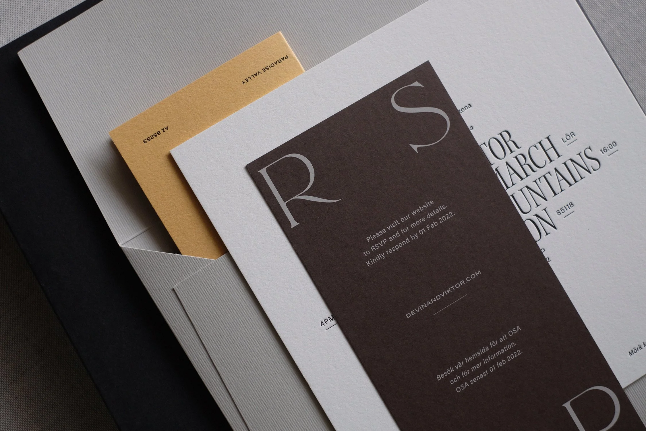

Here is that dress code on the ceremony invitation, which in Swedish is: Mörk kostym och ökenkompatibla skor. Again, kind of lucky that it was a similar length to the English version so these two footnotes balanced and framed the bottom of the invitation perfectly.

With the color palette and insert layouts decided, we began exploring various ways to include the Swedish text. The most obvious way to do this is just to print two separate versions. This is a more expensive solution, because it means extra print plates and two runs of smaller quantities, which is never ideal for letterpress printing, but not impossible! It also means a more complicated and time-consuming assembly process, because we have to carefully stuff each suite according to the guest list and names on the envelope ensuring that each person gets the right one. Then, if you really want to dig into this, it also presents the question of - if you’re sending to a couple where only one of them may be Swedish - which version do you send? Both? Separate ones? Ack, starts to get messy. These are the kinds of conversations we have as we work through the design phase and explore various ideas from visual, financial, and logistical angles.
Another idea was to screen print or digitally print the whole invitation in the second language as a vellum overlay and have everyone receive both. This would be more affordable solution than two separate letterpress jobs, would add an extra layer and texture to the palette of papers in the suite, and can be a sweet visual touch. But you then have to make the decision on which one is more “important” to be luxuriously letterpress printed on 710gsm cotton paper…and as one is his and the other is hers…it can be a little unfair to have to make that call. And, in the case of this particular design with large uppercase text, it also turned out a bit busy and overwhelming. We don’t want to be shouting. Twice.
Another option, which people will often ask for, is to go double-sided. But I don’t know. I’m never into double-sided. Seems like a trick that should be reserved for printing corporate meeting minutes on the office laser printer…or maybe (and only with very good reason) one of the other inserts in the suite…but please, not the ceremony invitation! It should be ceremonial. We can sometimes do fun patterns or textures or decorative design elements on the back as a little surprise or moment of tactility…but don’t make people turn it over to read. It’s not a menu at a roadside diner.

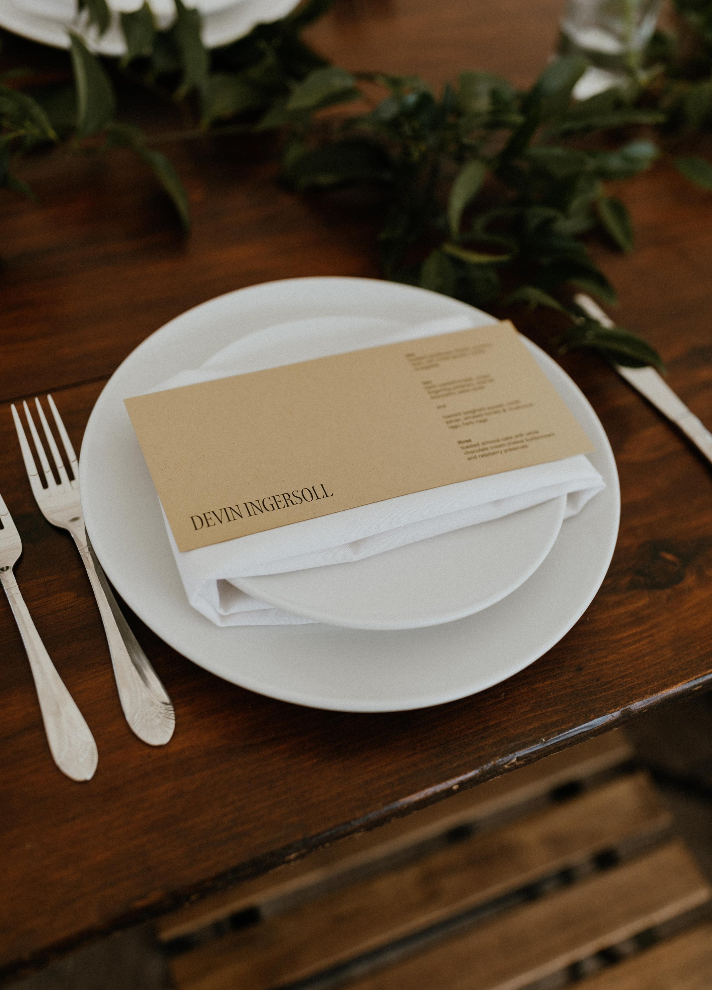
After trying and talking through all the possible variations, we settled on this. Leaving the large uppercase text in English only, and repeating only the small type in both languages. The “You are cordially invited” part at the top, the date below, and the day & time on the sides. It was elegant, it honored everybody equally, it kept assembly simple, and there were no additional costs.
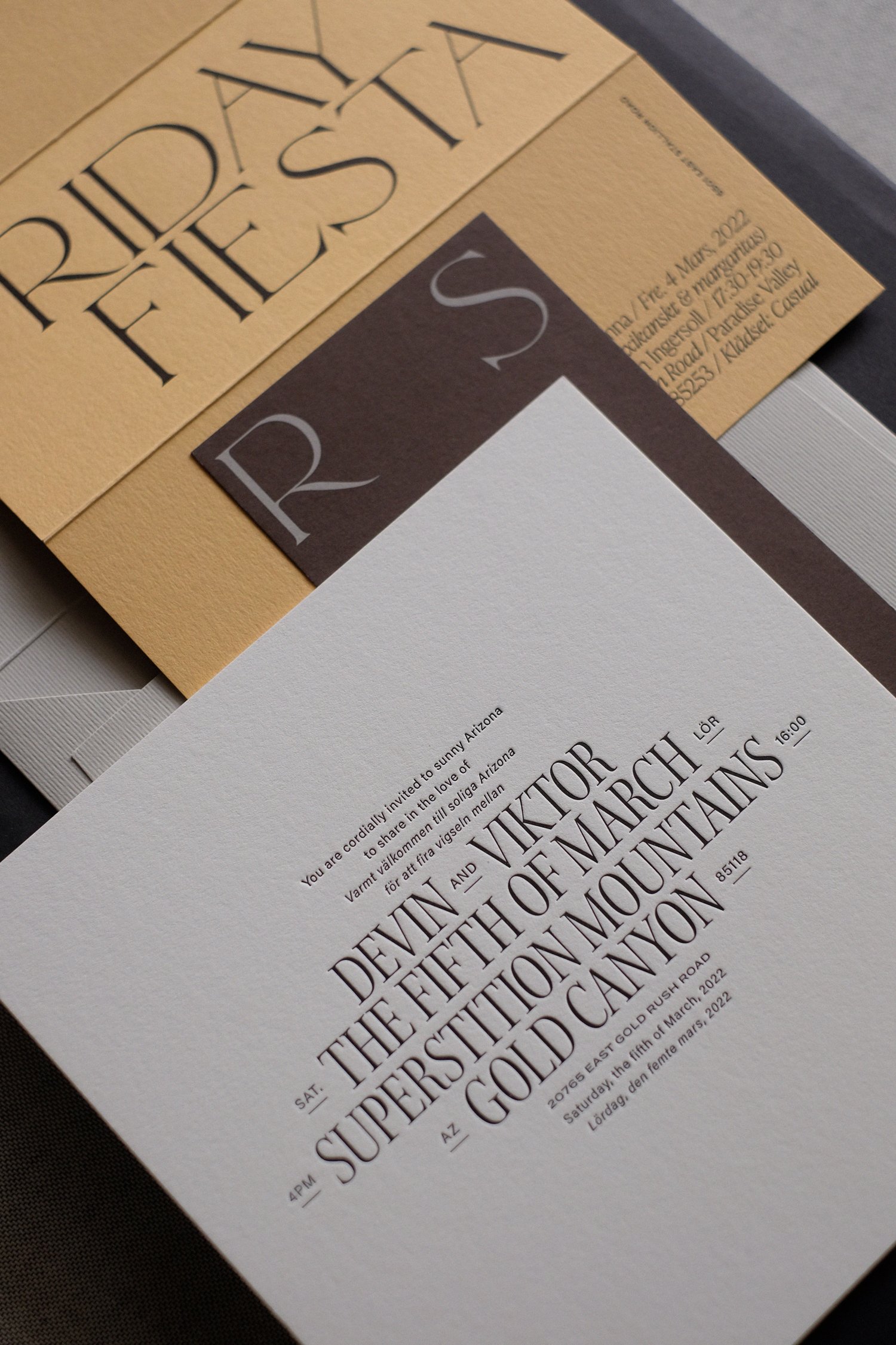
We then followed a similar format on both the online RSVP inserts and Friday Fiesta invitation so that all three pieces were bilingual, and everyone received the exact same suite.
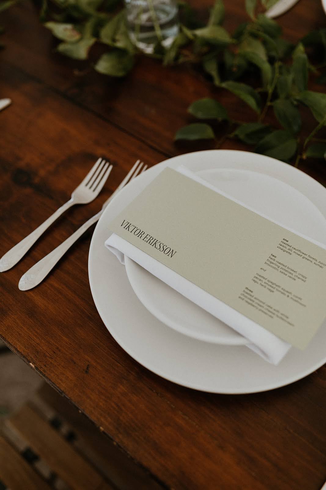
Now, you may notice that the type and layout used for the two inserts are not actually part of The Editor collection. We wanted to do something more festive and less formal for these pieces, and I was hard crushing on this typeface I had just discovered at the time…so I kind of threw it in as a wild card and they loved it.
That happens sometimes. I’ll ask the couple, is there anything else we could call this event besides “Rehearsal Dinner” or “Welcome Dinner,” (meh, meh), and they’ll say, “well it will be all Mexican food, so we could call it a Fiesta”… But then I’ll see the word FIESTA and think, we need to change the font. The Editor does a lot of things, but she does not FIESTA.

The typeface is called Traviata, has fun alternate Ps and Rs, and is by one of my favorite Parisian-based multidisciplinary design studios, Violane et Jérémy. (Incidentally, two names that if I ever saw on a wedding enquiry form - I’d get typographically excited about).
Ok, I think I’ve nerded out enough on paper and type and tittles. Enjoy the rest of the images from the party and please, if you’re planning a desert wedding - get in touch! It has now become one of my favorite wedding destinations and vibes…and I have so many more fitting papers and palettes I’m longing to explore…


SEE MORE
Explore The Editor Collection here, or see The Editor Pinterest board for styling inspiration.
Or, explore similar destination weddings set amidst breathtaking natural scenery:
In Park City, Utah…in the Scottish Highlands…or in the Catskills in upstate New York.
Wherever you go, stay inspired.
xo