
There are wedding trends that announce the year they were born. The blush pinks of the early 2010s. Dusty blue. Sage green. Terracotta. The inevitable butter yellow that's quietly making its entrance. And then there's black and white. It belongs to no particular season. It feels equally at home in a London townhouse, a New York museum, a Tuscan villa or the groom’s parents’ Cotswolds garden.
Over the last decade, we've had the privilege of designing wedding stationery for couples across the world. Some wanted romantic, others editorial. Some dreamed of understated luxury, others of dramatic typography and bold statements. Yet despite wildly different personalities, venues and stories, we keep returning to the same palette.
When color steps aside, every other decision becomes more important. The paper must be extraordinary. The typography must carry emotion. Every millimeter of spacing matters. Every letterpress impression, every vellum overlay, every blind emboss.
These are nineteen of our favorite black and white wedding projects. Together, they make a quiet argument for simplicity.
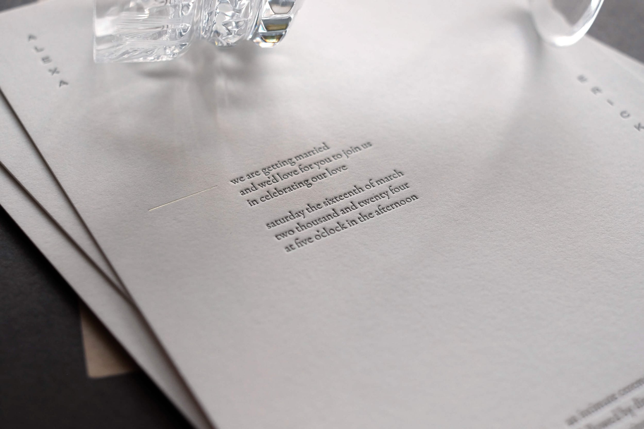
Exquisite letterpress details from The Curator collection.
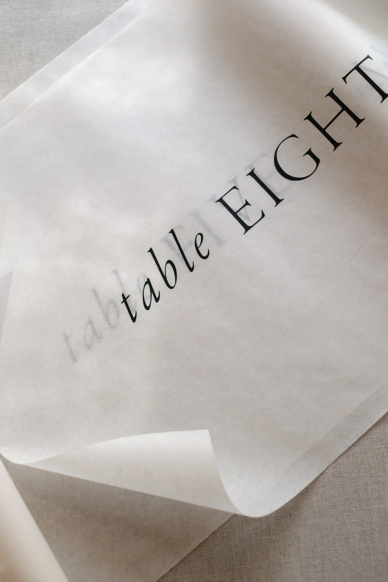
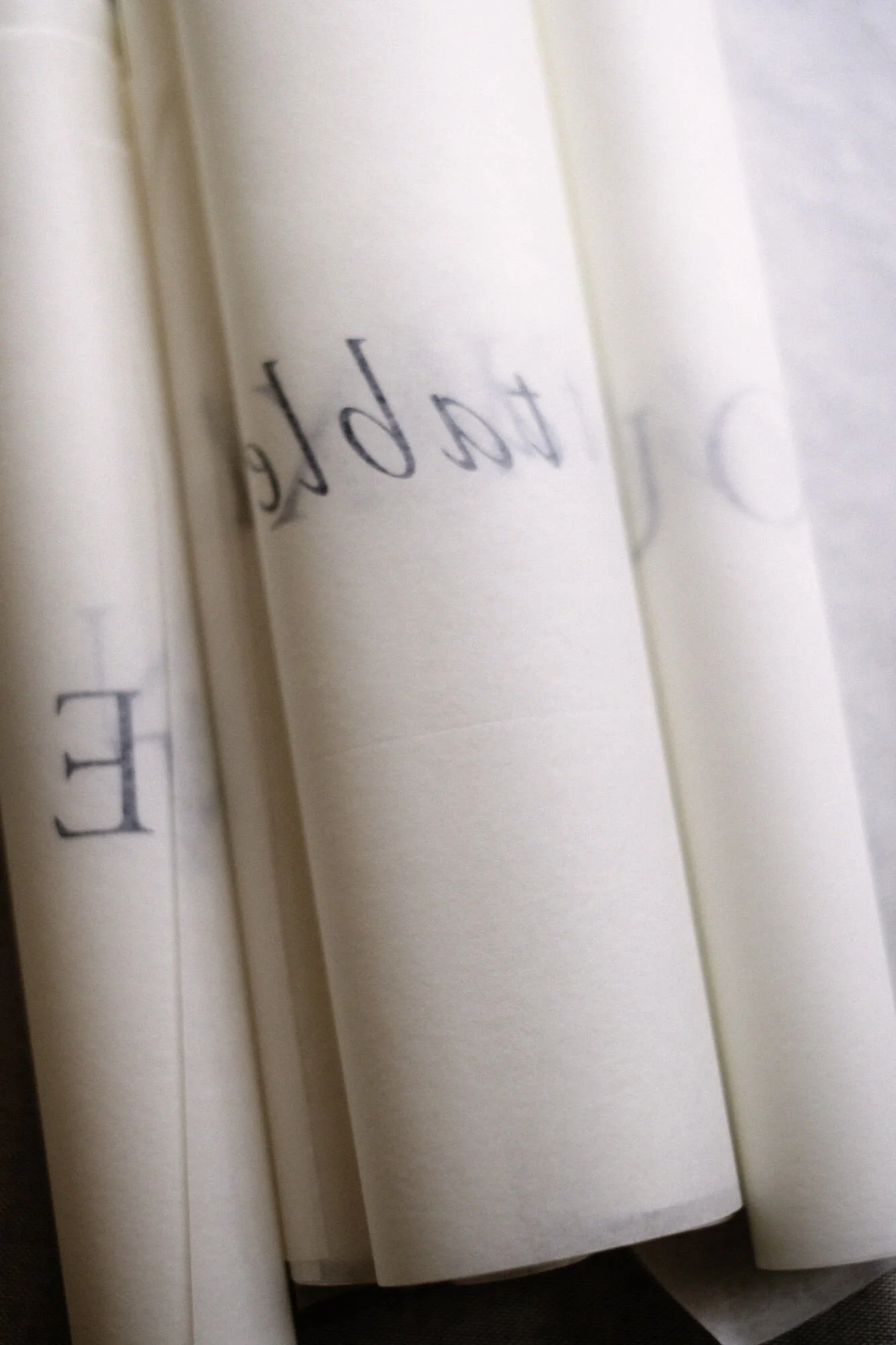
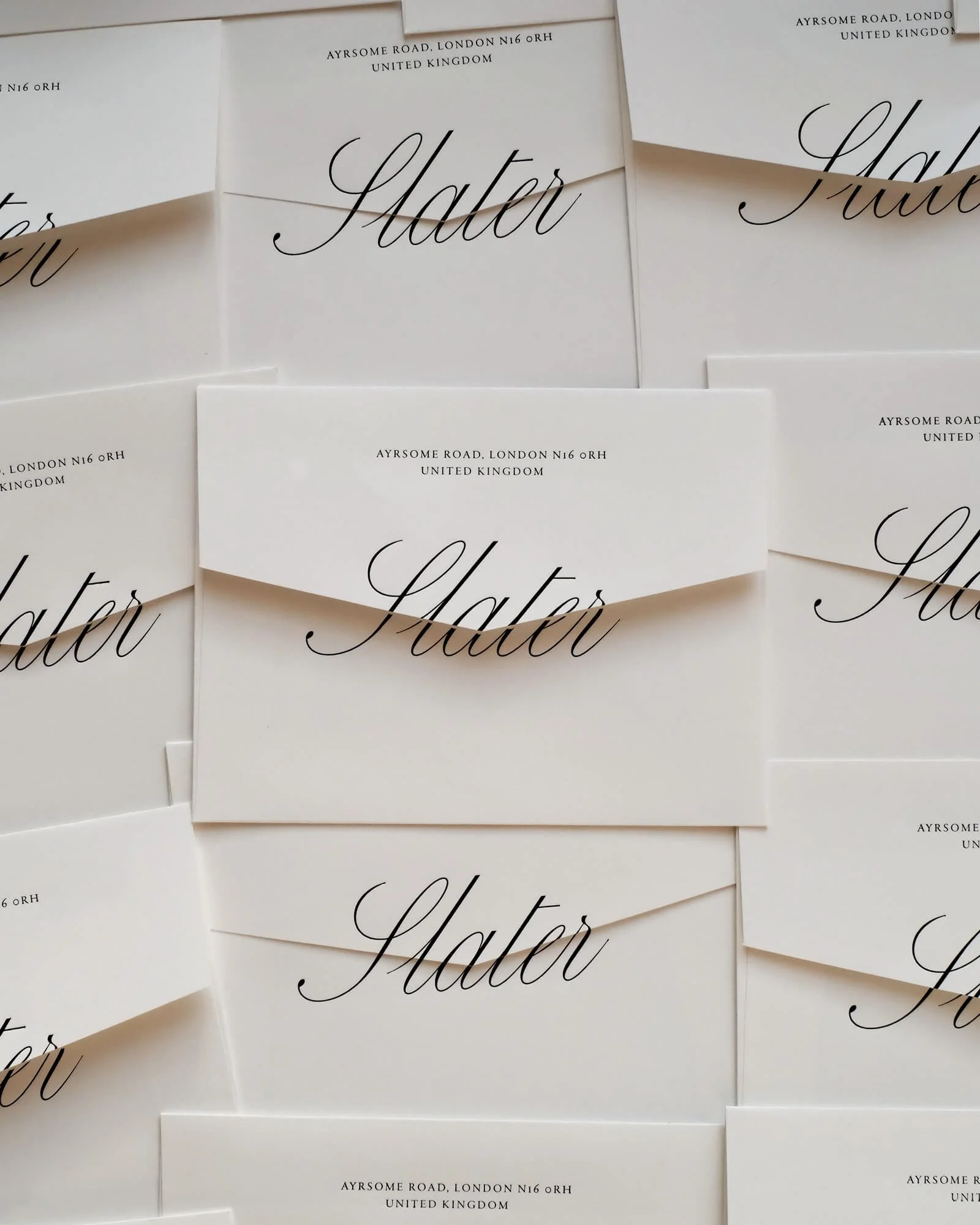
Statement envelopes for guest thank you notes.
Black ink doesn't compete.
The best invitations rarely fight for your attention. They simply deserve it.
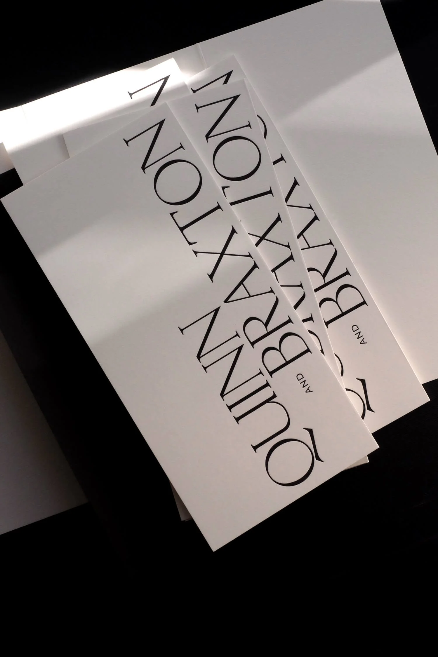
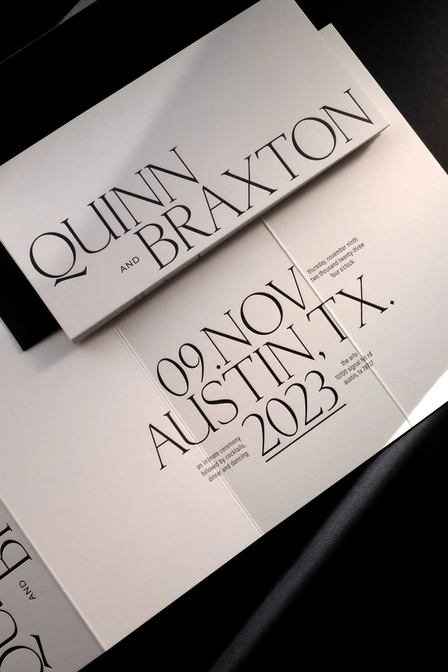
Black ink on white paper has a remarkable way of slowing people down. Instead of being distracted by color, your eye begins to notice proportions. A beautifully drawn serif. The elegance of a single line of script. The generous space surrounding a pair of names.
Suddenly, typography isn't just carrying information. It becomes the decoration itself.
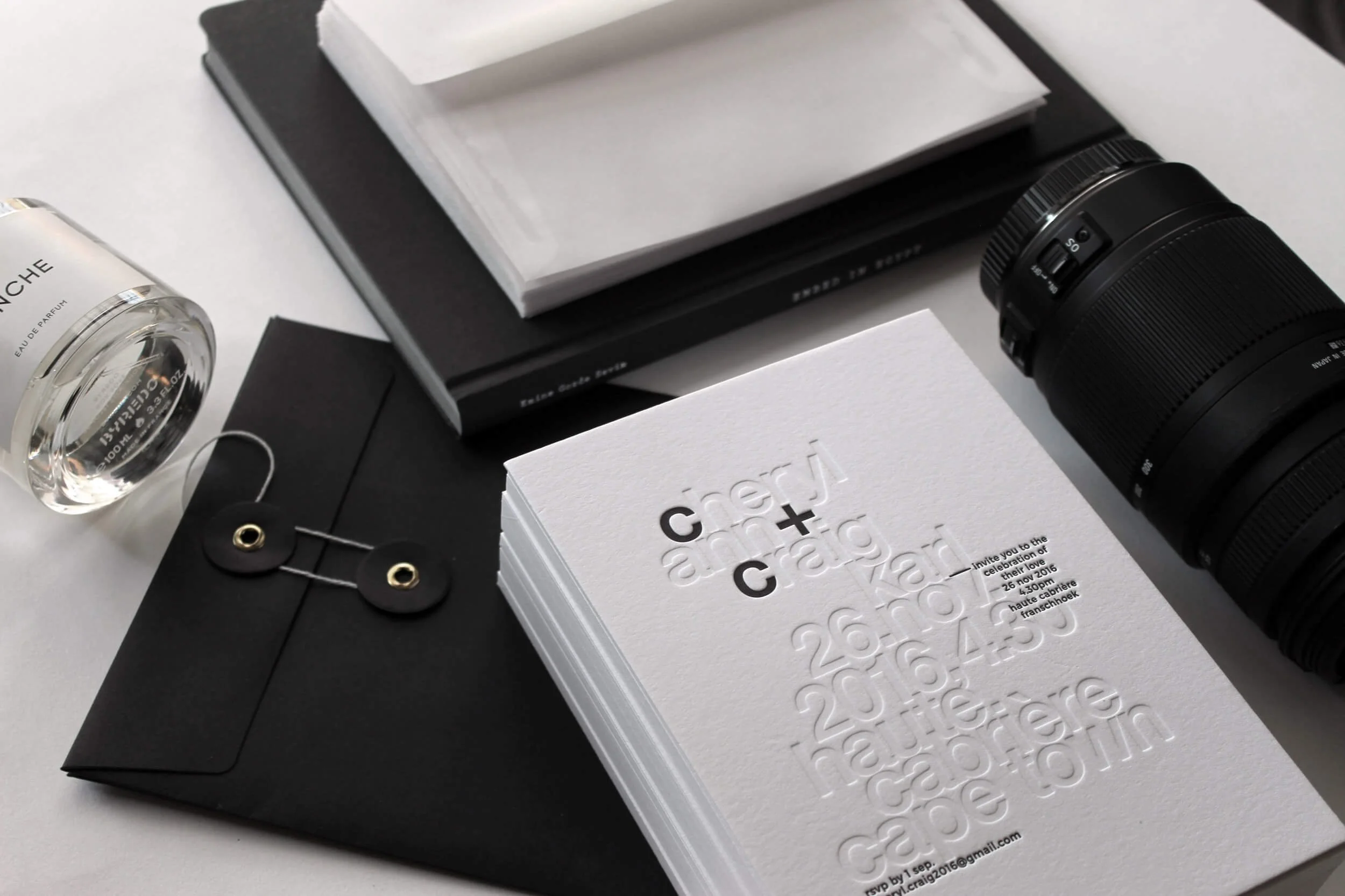
An oldie but a goodie, fully in lowercase Helvetica.
Luxury is subtraction.
Luxury has a habit of being misunderstood. It's often associated with adding more. More foil. More colours. More embellishment. More layers. In reality, the hardest thing a designer can do is decide what doesn't belong.
Every unnecessary flourish removed gives greater significance to the elements that remain. A single blind deboss can become more captivating than a page filled with ornament. One perfectly chosen typeface can communicate more personality than an elaborate illustration.
Restraint isn't the absence of creativity. It's confidence.
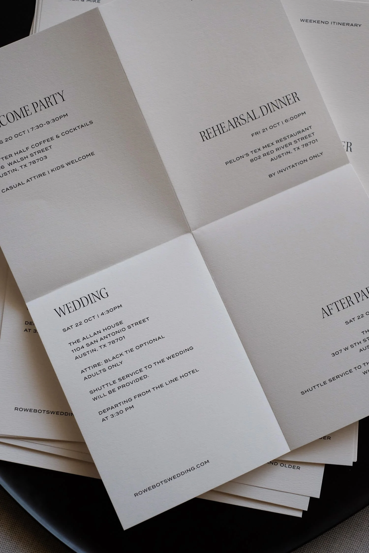
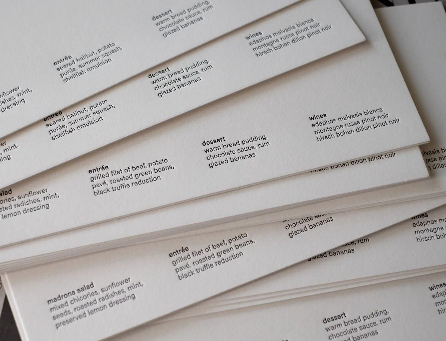
Less is always, always more.
WHITE HAS TEXTURE.
White isn't one color. It can be warm or cool. Crisp or velvety. Smooth or deeply tactile. It can swallow light or gently reflect it. On soft cotton paper, white becomes almost sculptural, revealing subtle impressions that disappear until the card is tilted ever so slightly in your hand. This is where paper stops being a surface and starts becoming part of the design.
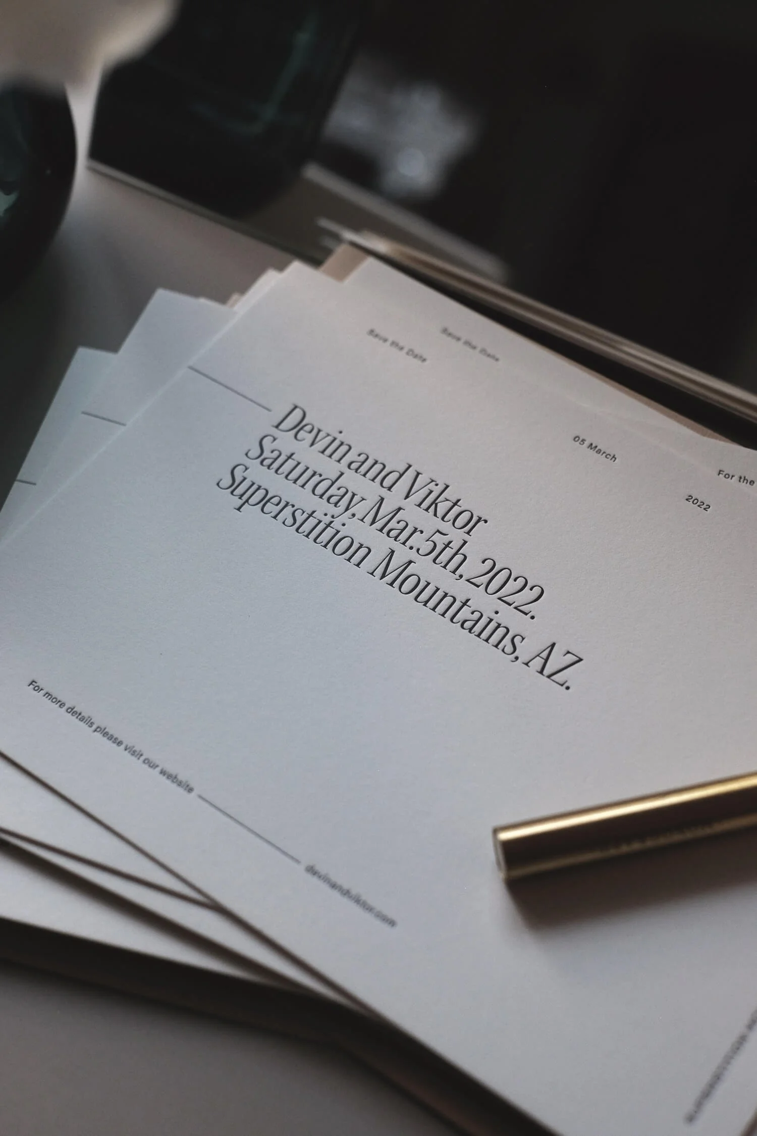
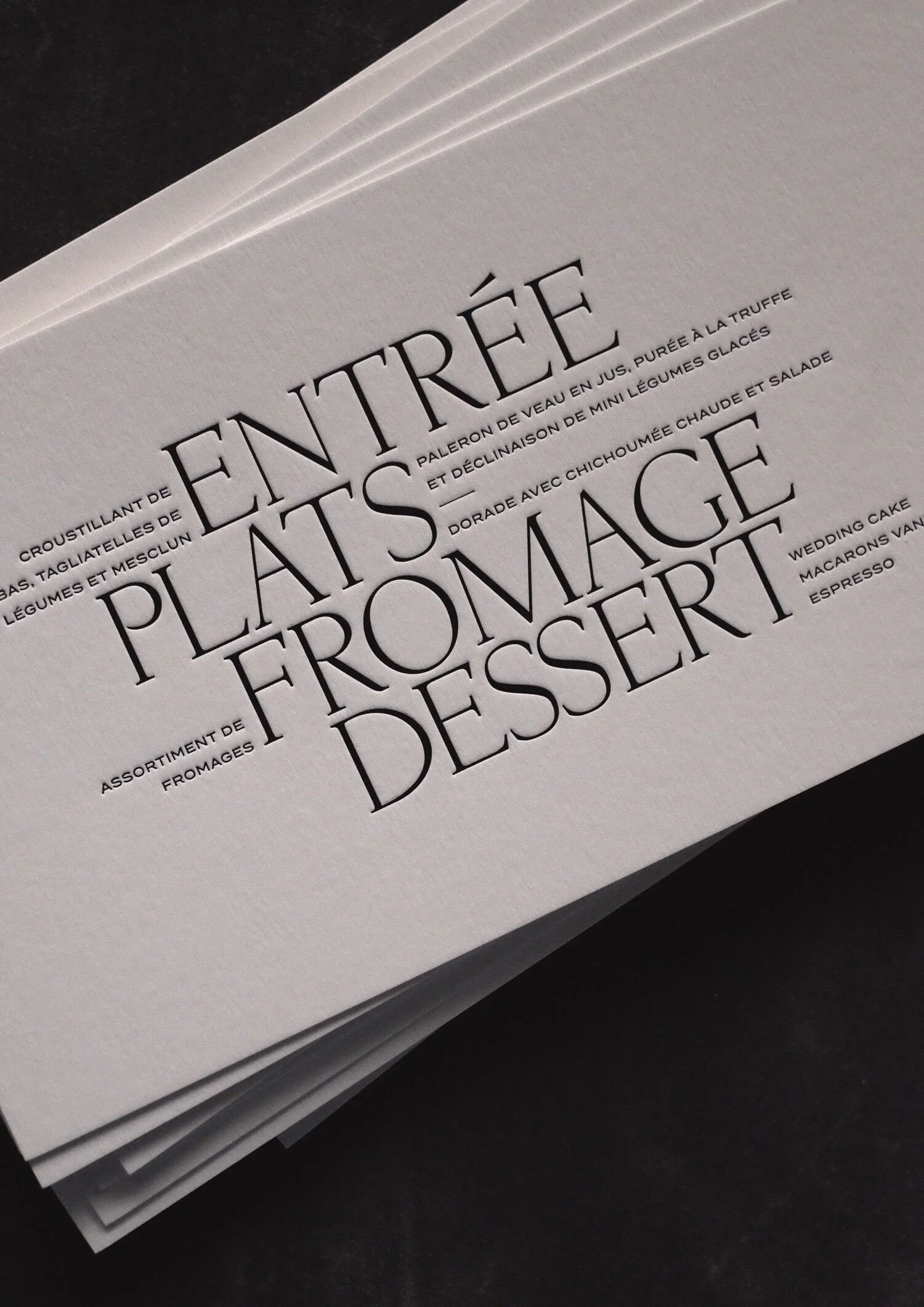
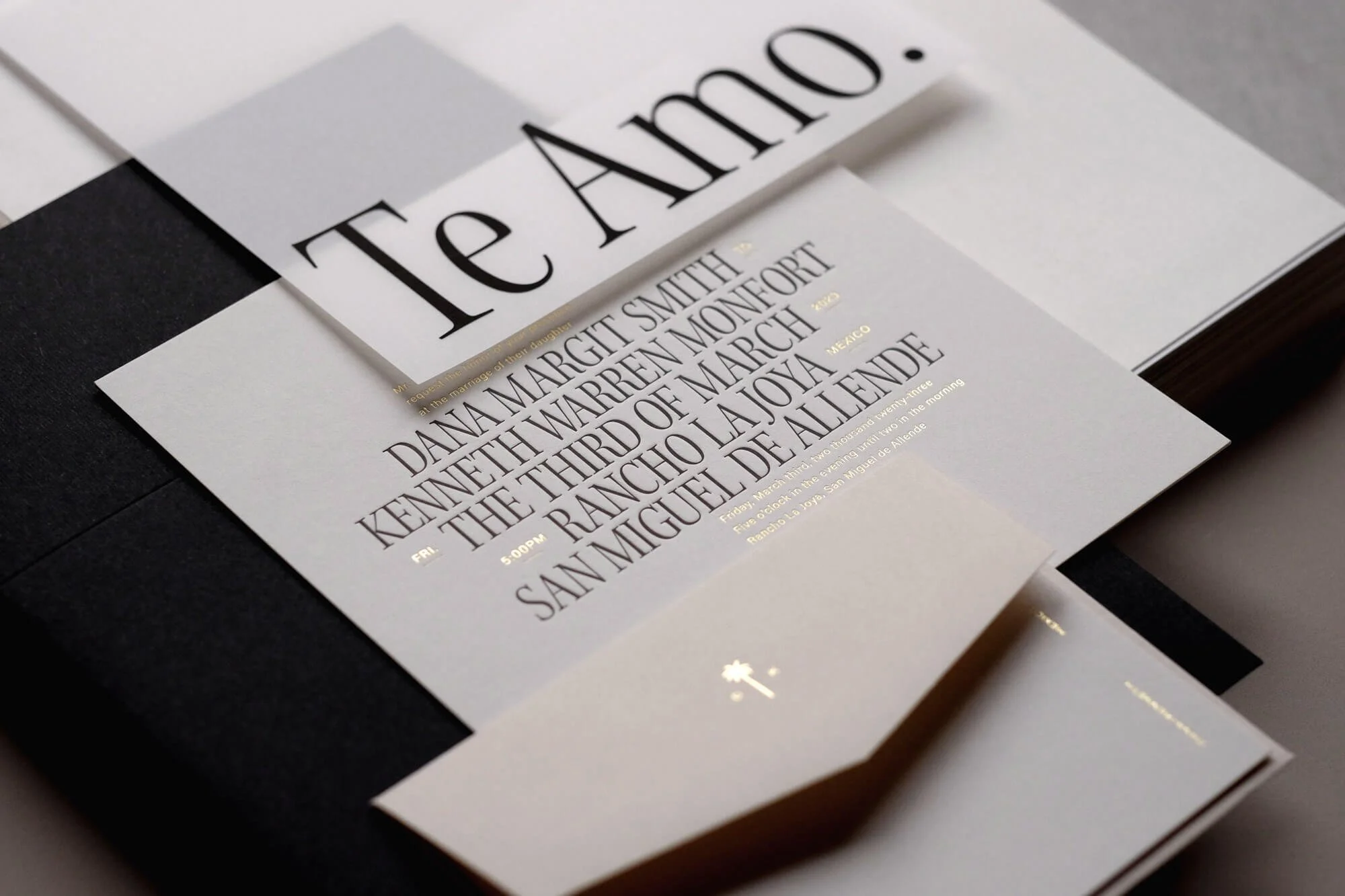
One of our most popular, and most endlessly stylish collections, The Editor.
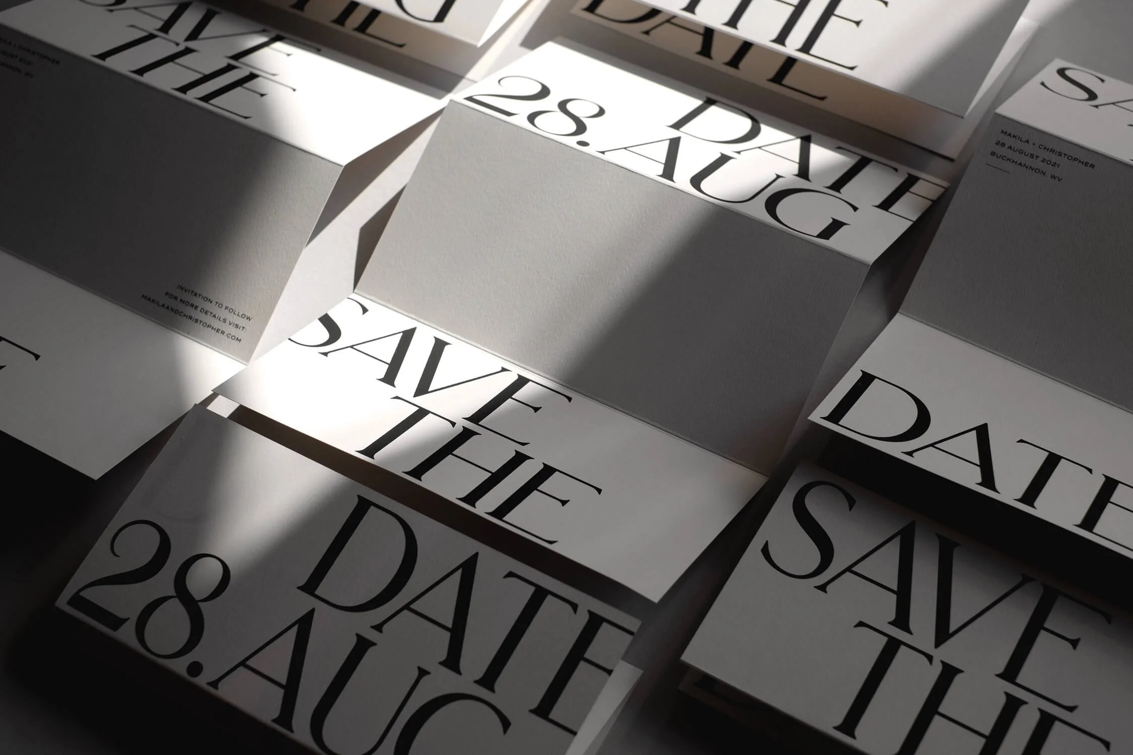
TYPOGRAPHY DESERVES CENTRE STAGE.
Two names. A place. A date. An invitation. There's something deeply romantic about allowing language to carry the emotion.
Throughout these projects you'll notice oversized names stretching confidently across envelopes, tiny lines of carefully composed body copy, expressive scripts dancing beside disciplined modern serifs. Each piece feels different and yet they all rely on exactly the same ingredients.
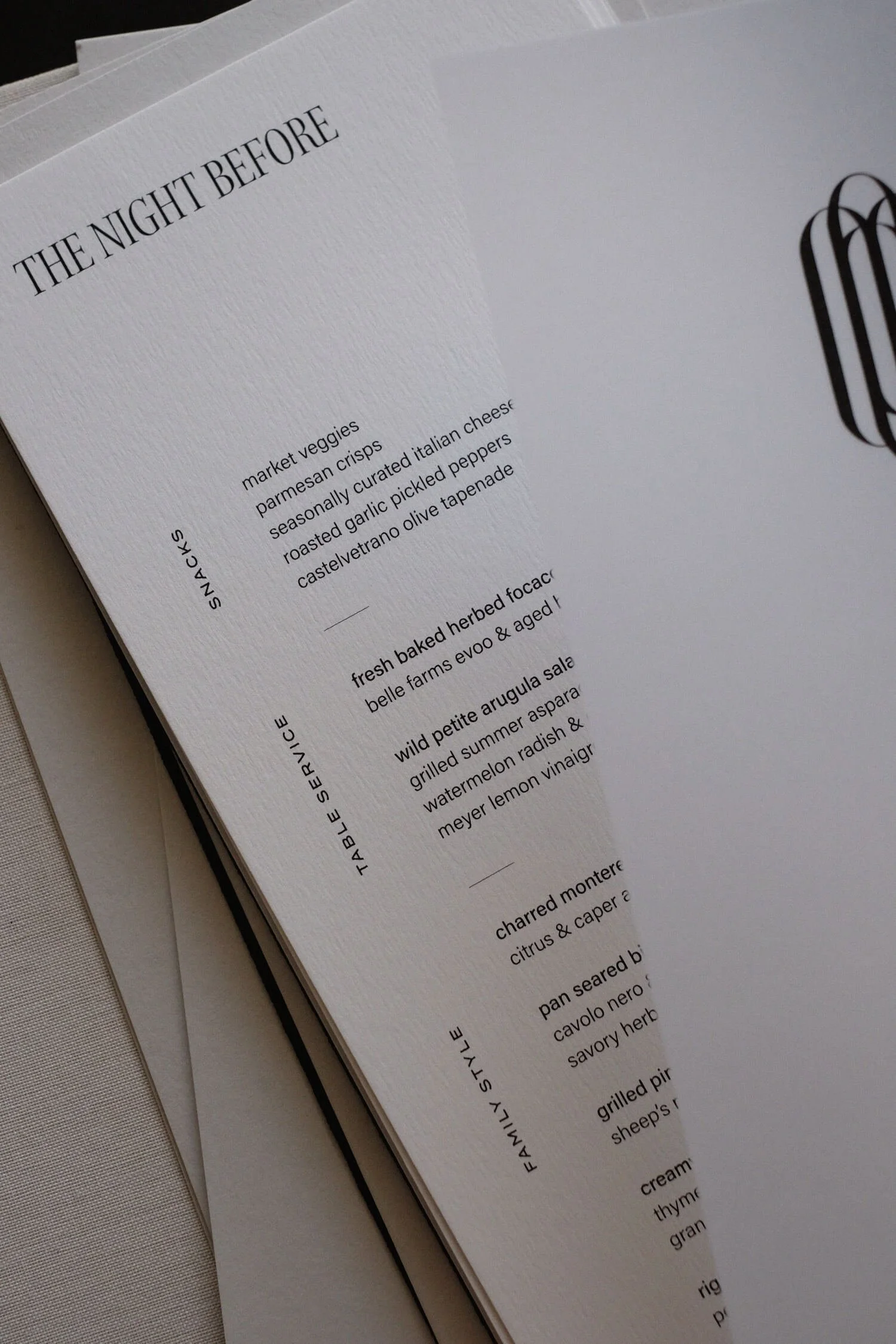
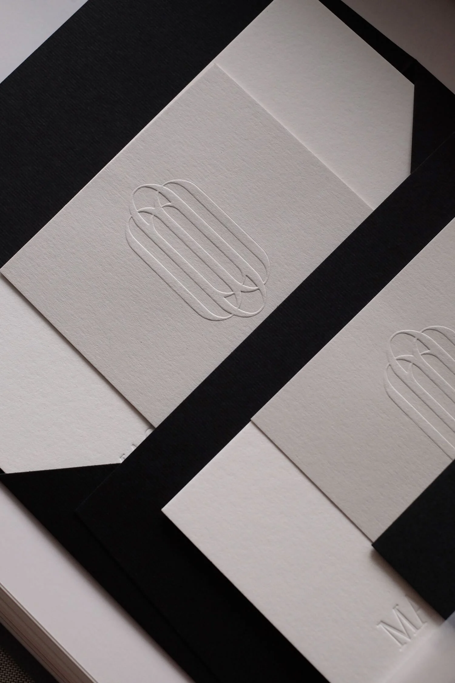
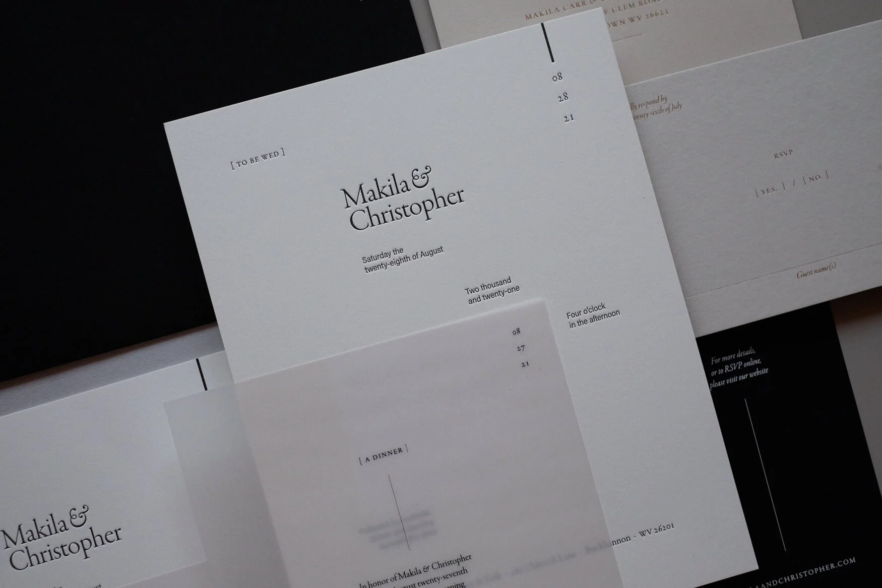
The quiet restraint of The Poet collection.
QUIET DETAILS HOLD ATTENTION
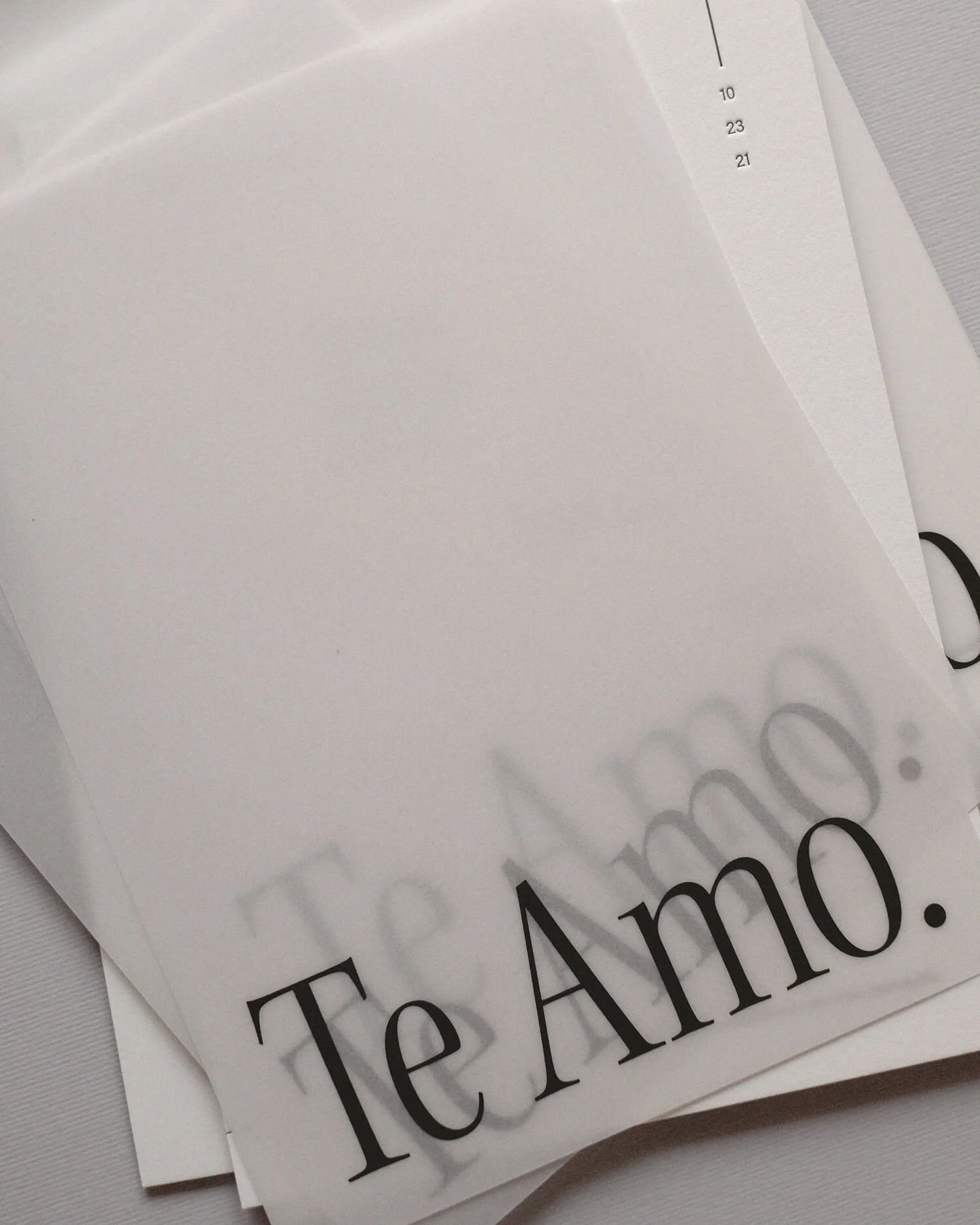
Some of our favorite moments are the ones people don't notice immediately. The blind emboss that only appears when afternoon sunlight moves across the paper. The vellum overlay that reveals just enough beneath it. The tiny line of gold foil that catches the eye for a second before disappearing again. Design doesn't always need a grand gesture. Sometimes its greatest success is inviting someone to look twice.
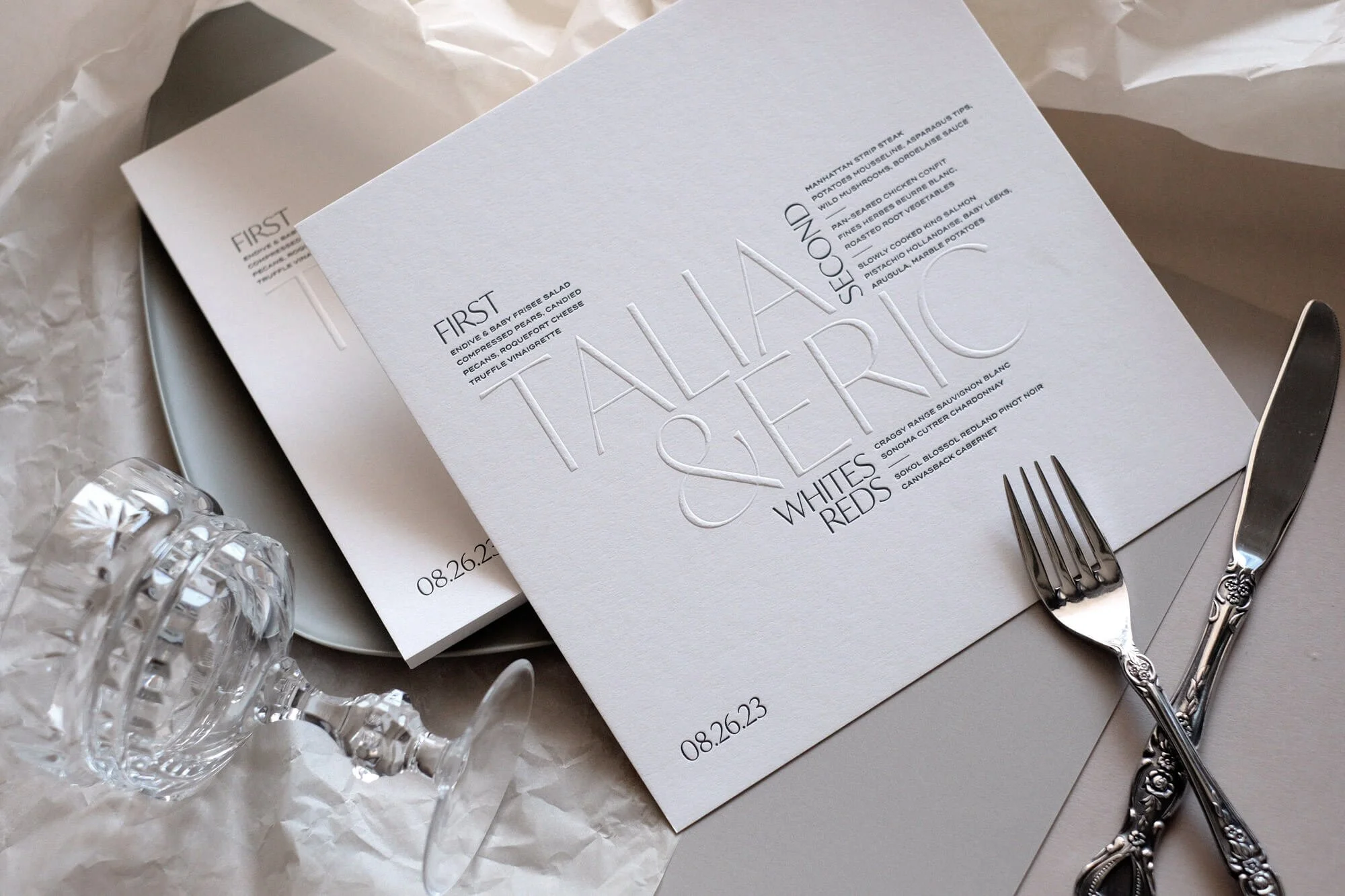
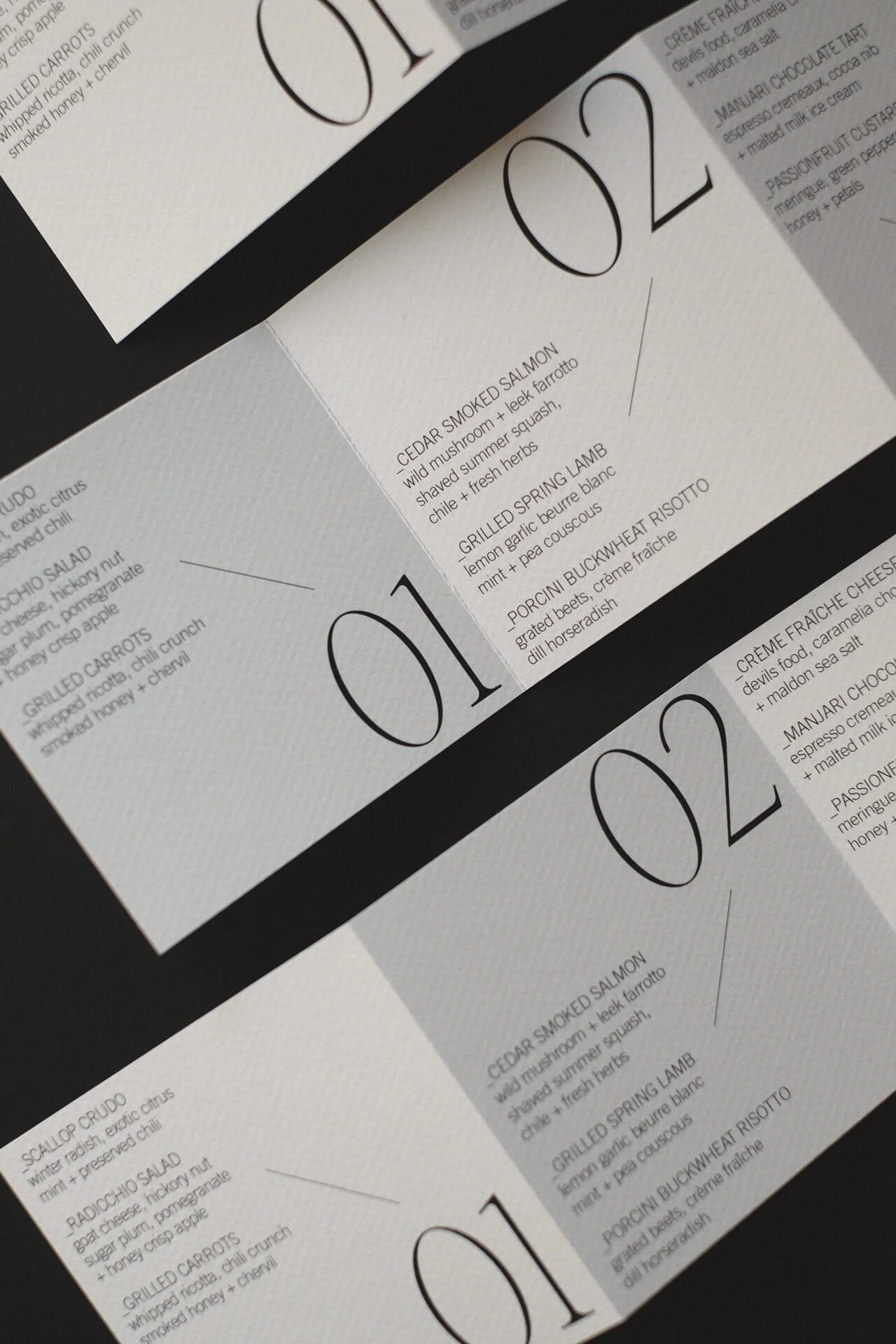
Always a crowd pleaser, our square menu format from The Dreamer collection.
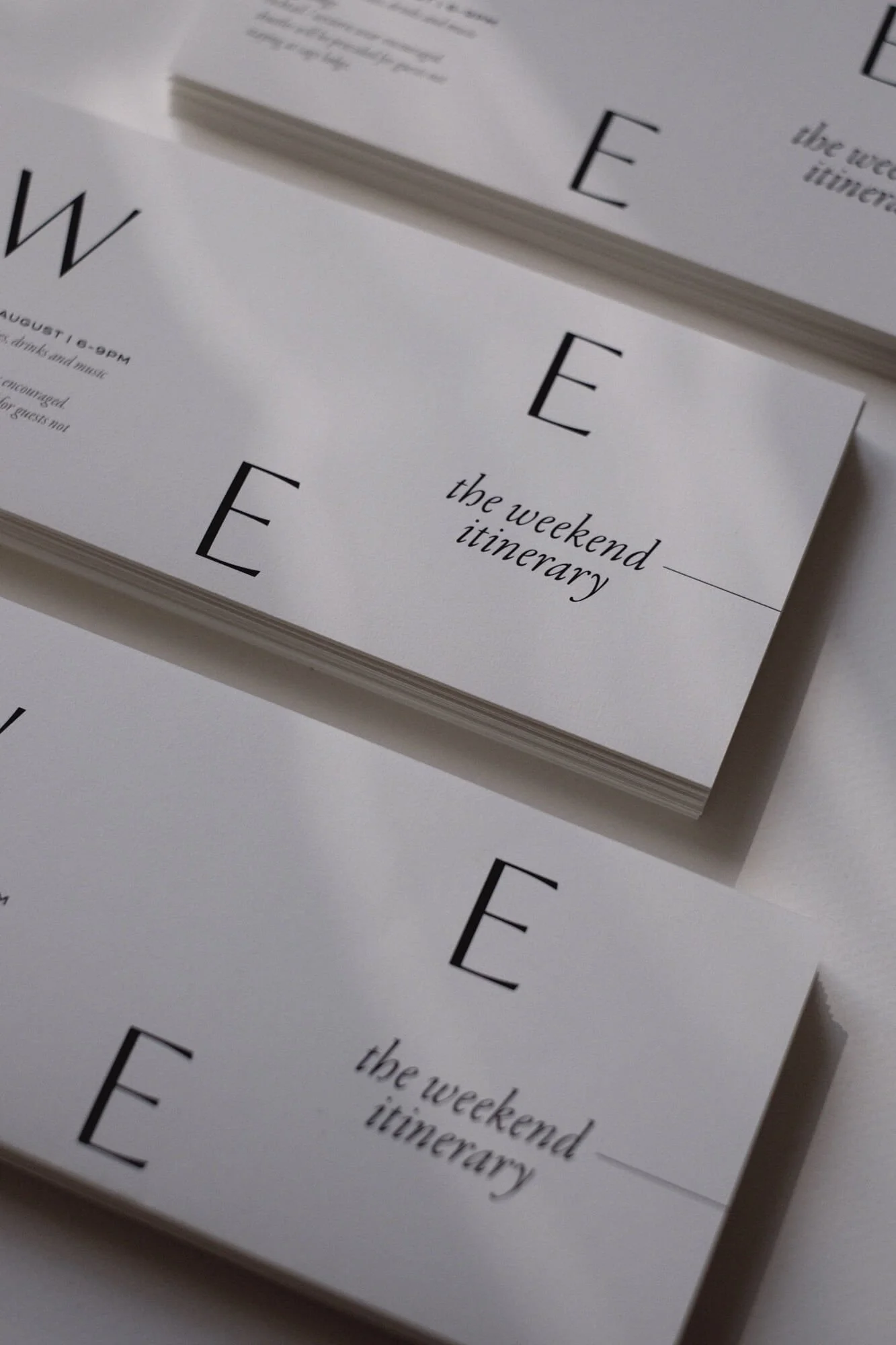
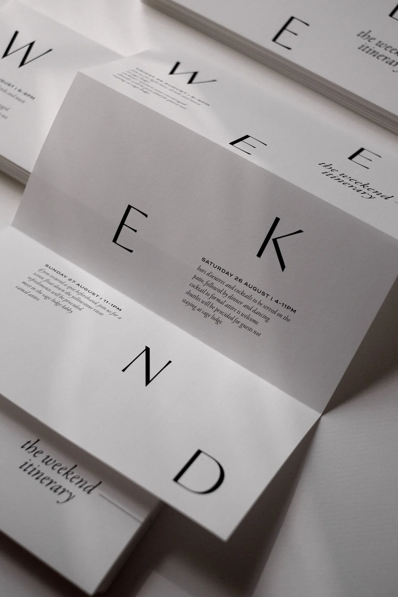
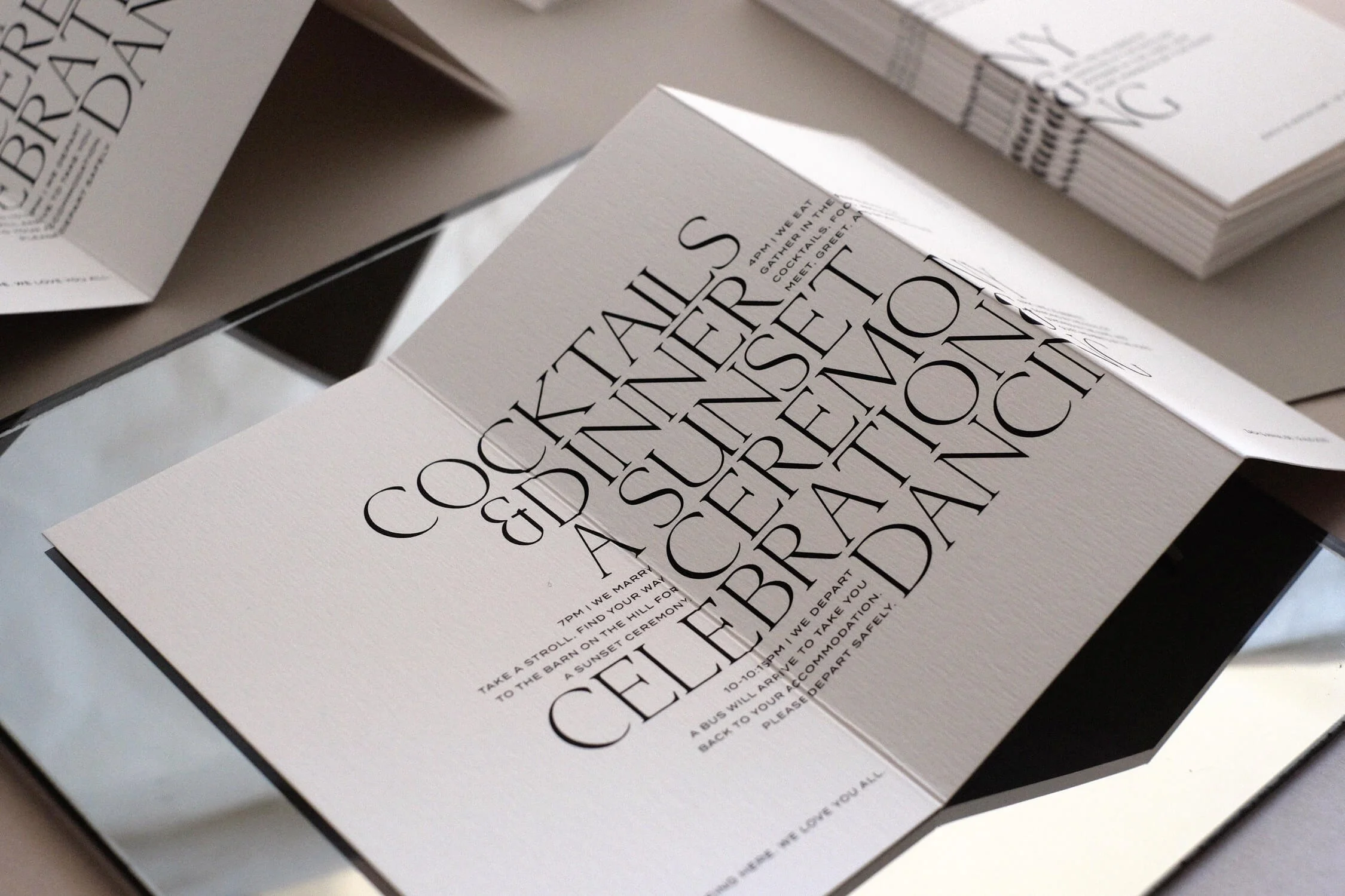
Large enough to make a statement, small enough to fit in a clutch - the weekend program from The Novelist collection.
A FEW THINGS WE KNOW AFTER OVER A DECADE DESIGNING WEDDING STATIONERY.
Beautiful paper is never trying to impress you.
Typography is often the most expressive illustration.
Negative space is part of the composition, not what's left over.
Simplicity takes longer to design than complexity.
Restraint is one of the boldest creative decisions you can make.
The smallest details are often remembered the longest.
Planning your own wedding? Explore our semi-custom wedding stationery collections, or get in touch to begin designing something that will feel just as beautiful decades from now as it does on the day it arrives in your guests' hands.